BIPOBeauty Clinic
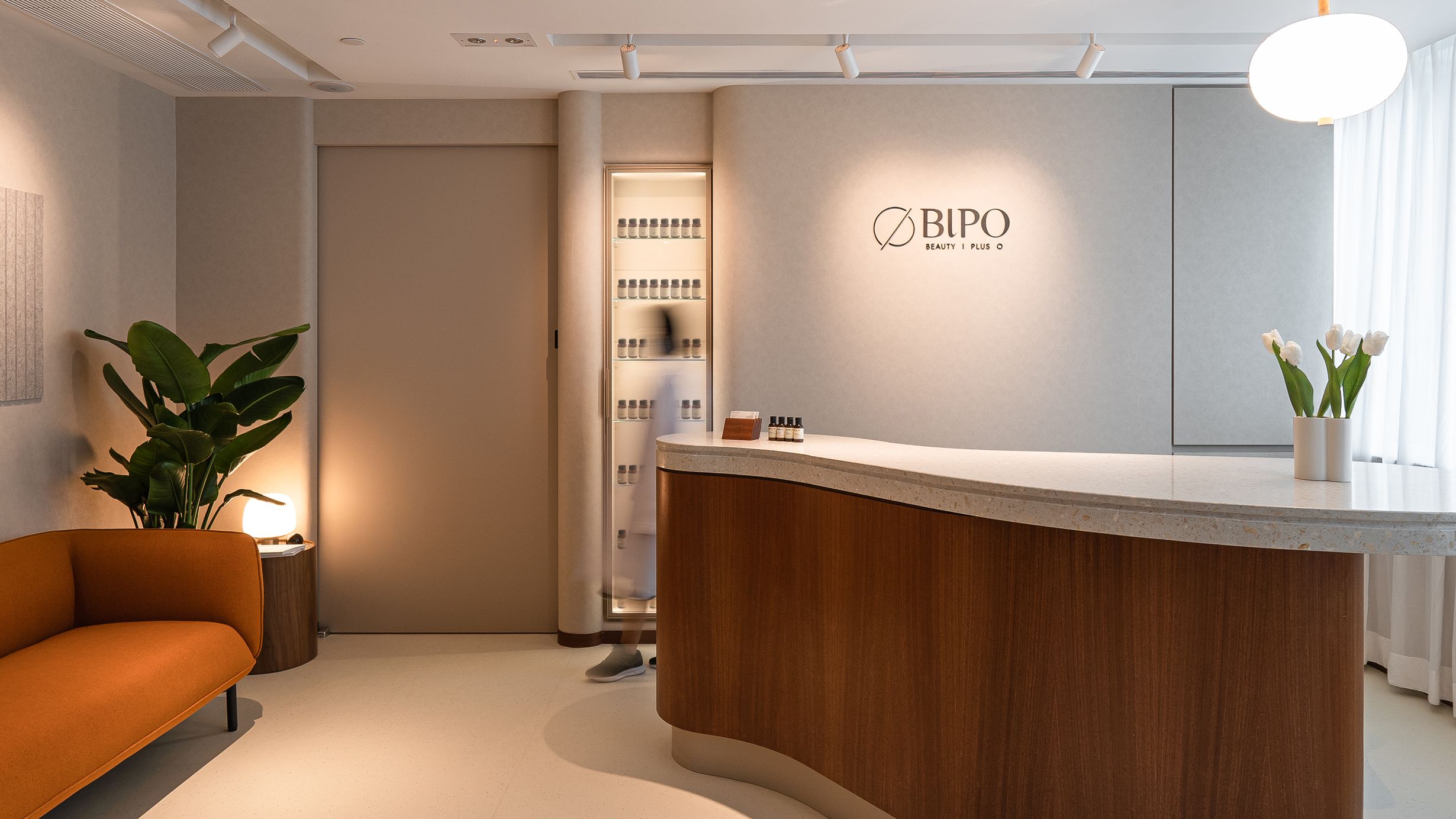
BIPO is a beauty clinic that pursues a comprehensive total beauty solution for its customers. We hope to bring a soothing getaway experience to the customers, melting away their stresses to regain harmony between their inner and outer bodies.
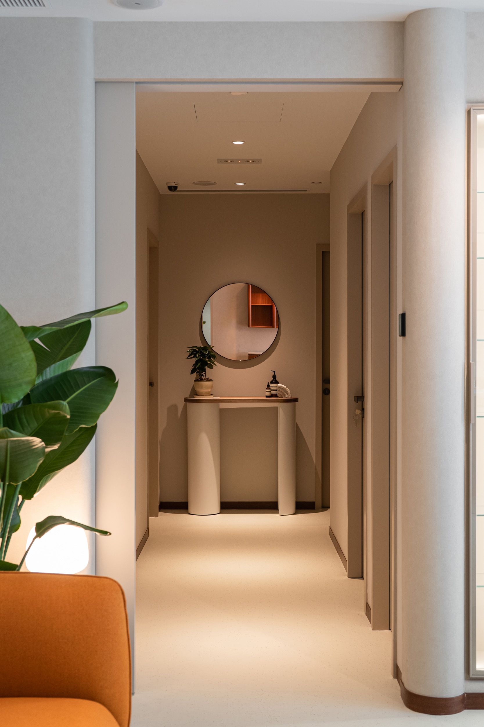
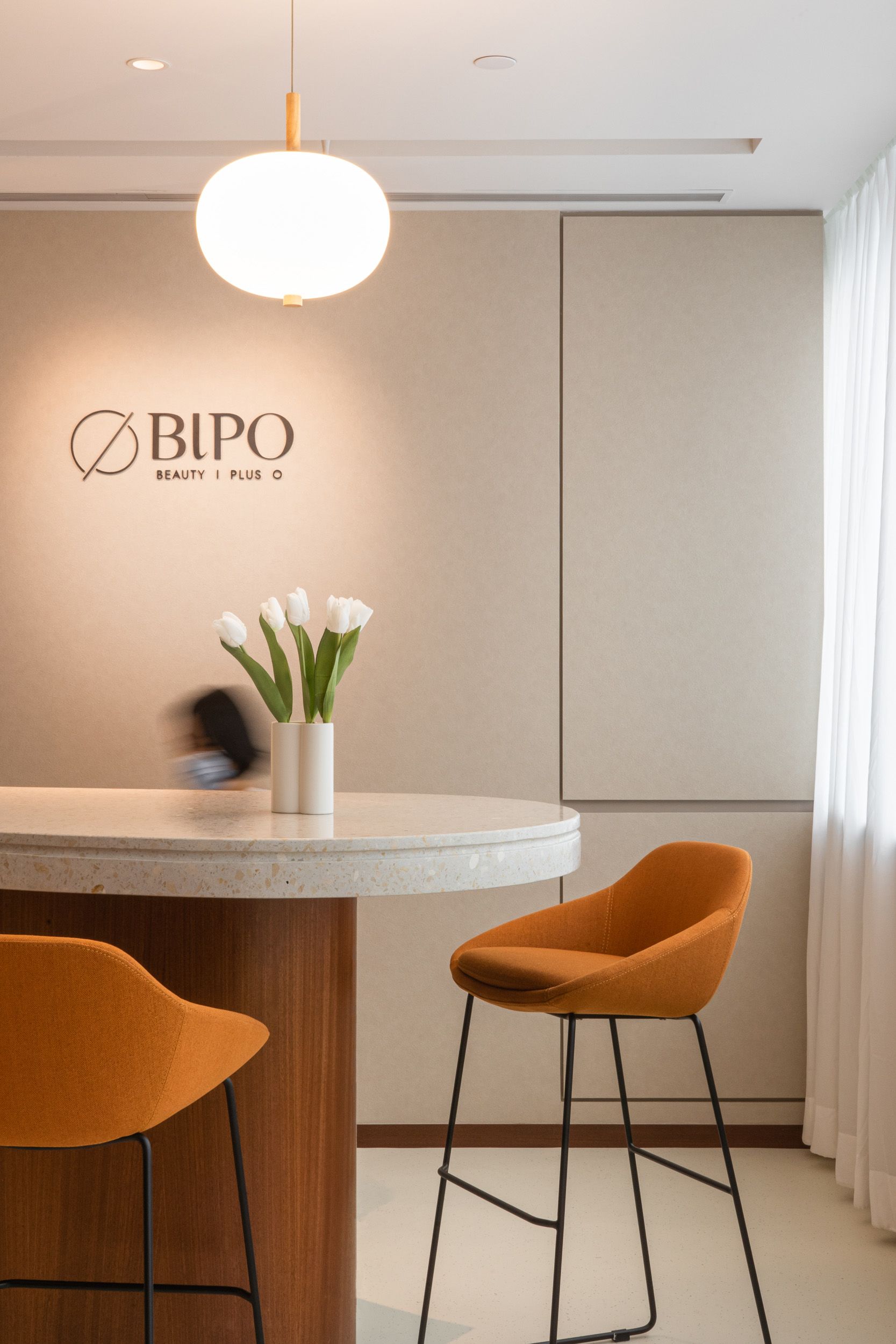
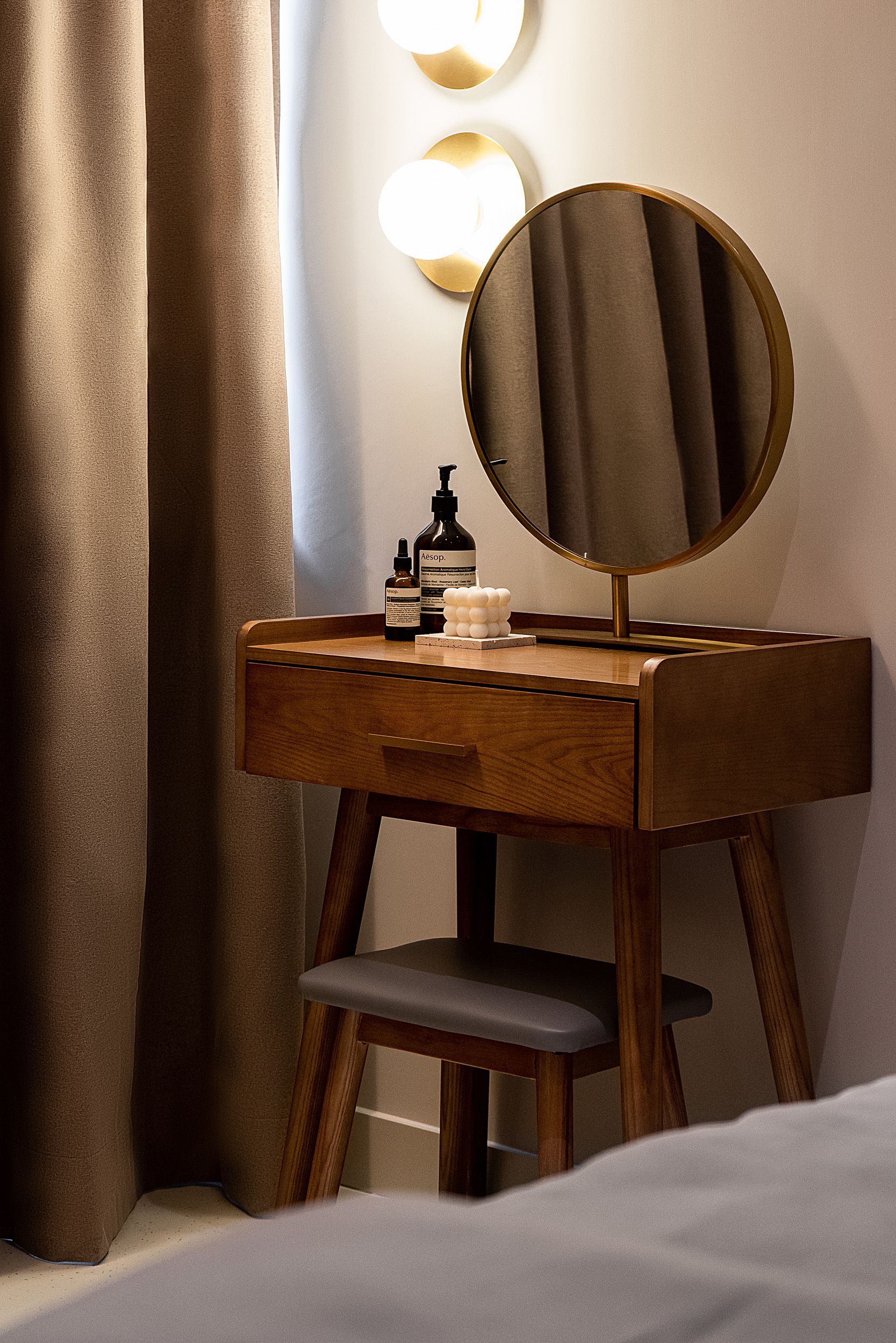
Moving on is a long and dimly lit corridor that leads to private clinic rooms. In contrast to the public area, the rooms have darker flooring and wall finishes as well as thick curtains to create a quiet and cozy environment for relaxing treatments.
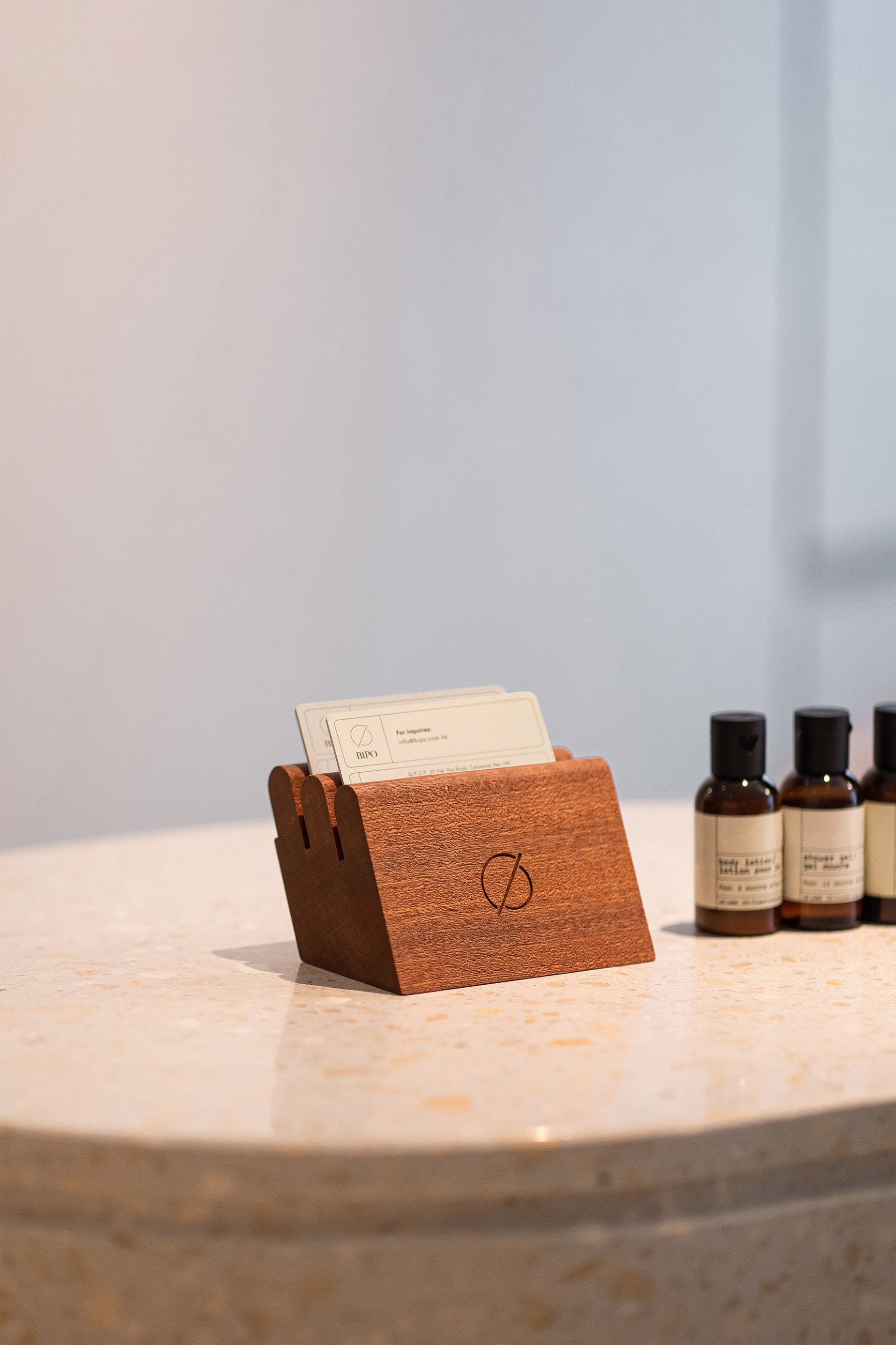
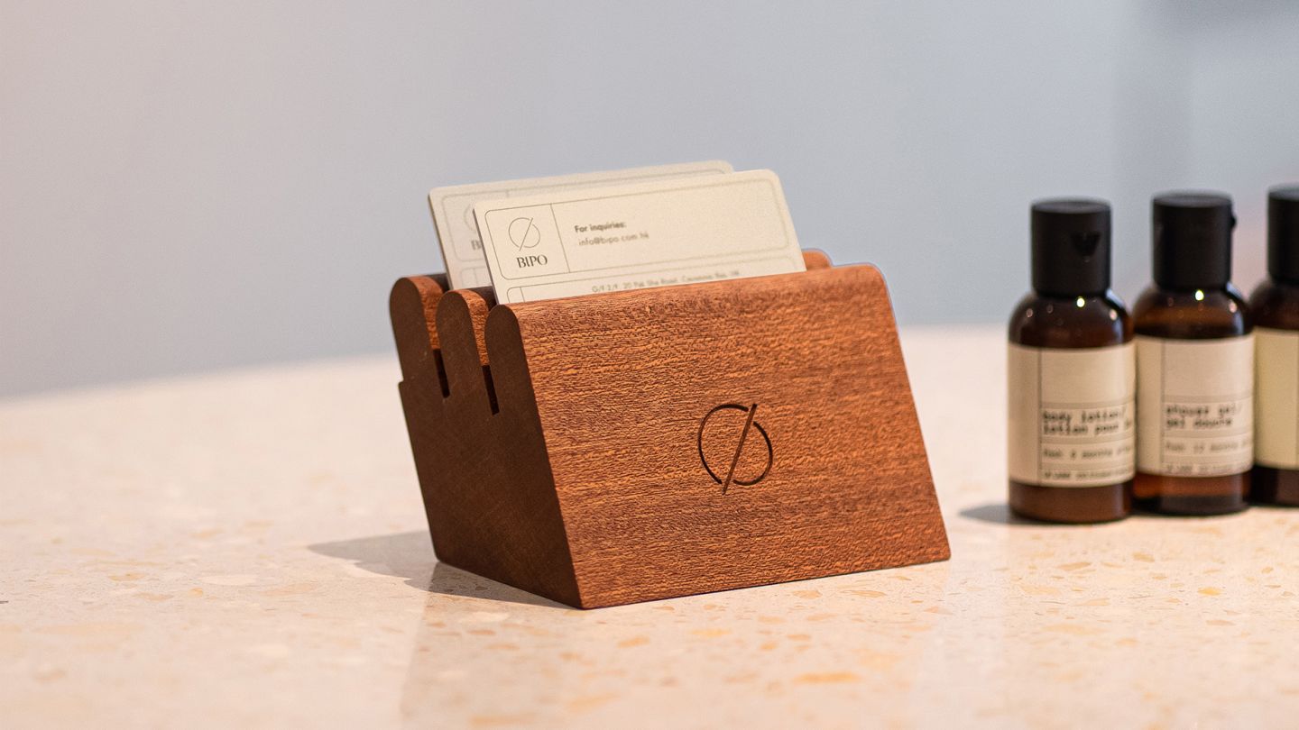
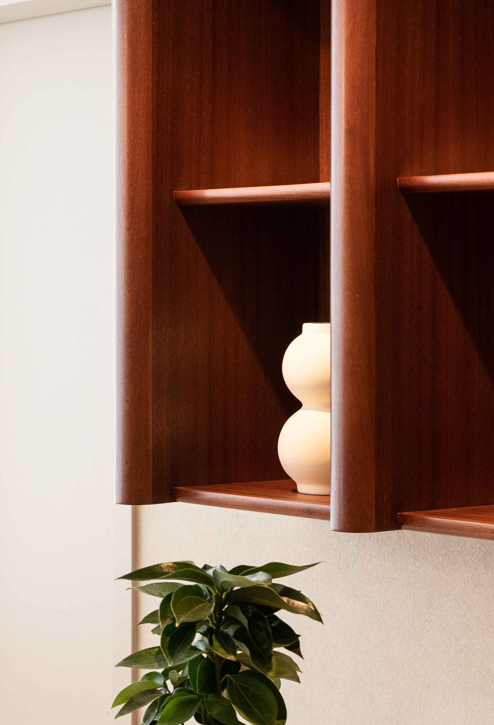
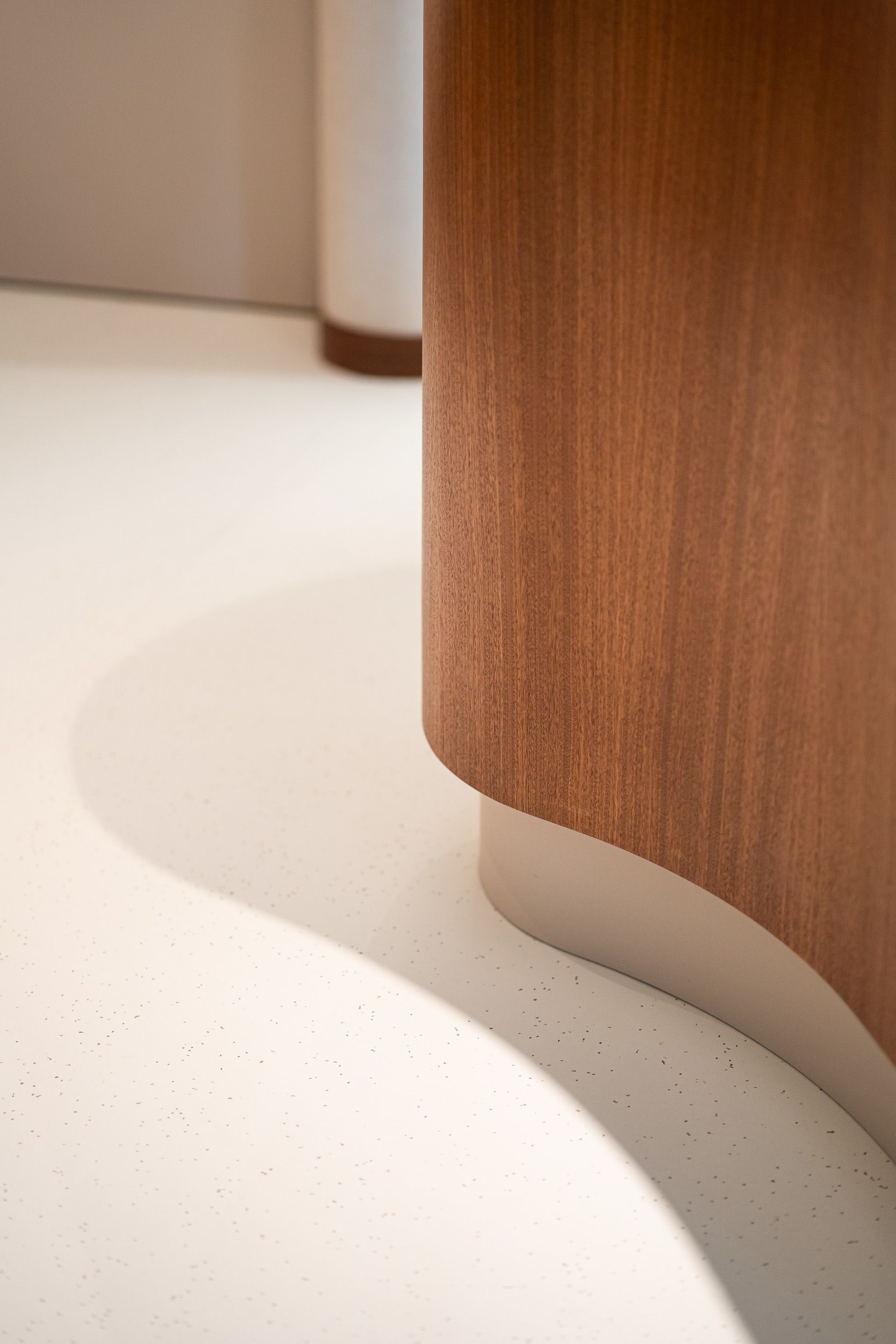
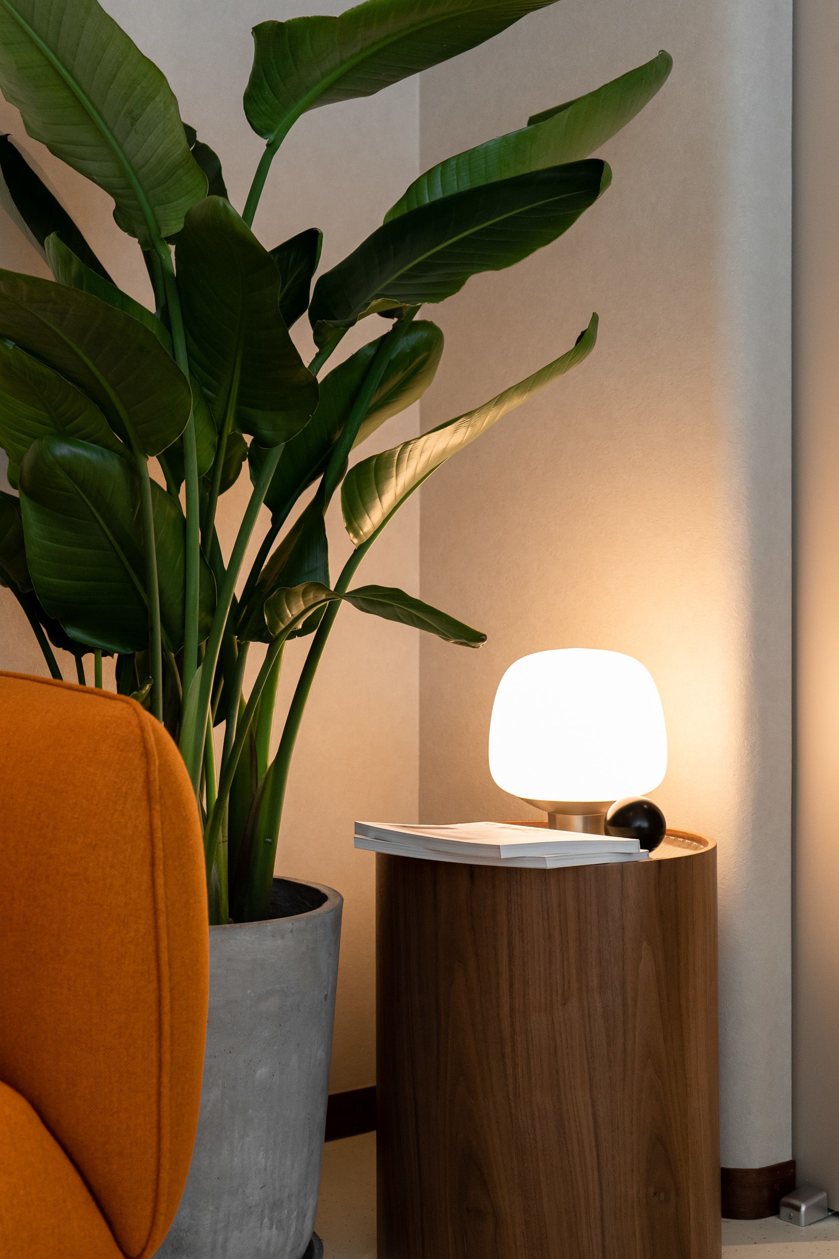
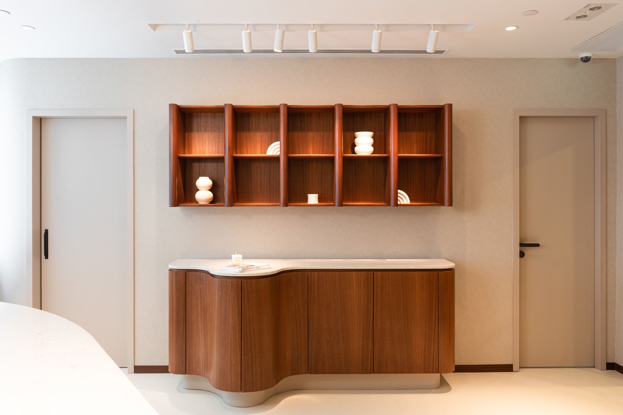
The whole shop is filled with earth tone materials, including environmentally friendly acoustic boards, sustainable flooring, upholstered furniture and even touch of greenery, to give colors and texture to the space while absorbing sound reflection at the same time. Full height curvatures are express in columns, while small one are in built-in shelves. The same language is carried on in the wooden name card stand and the outdoor metal leaflet stand, expressing the continuous flow of beauty and health between the inside and out.
Brand Identity Concept
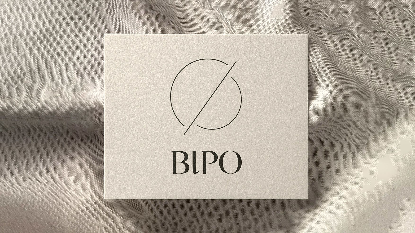
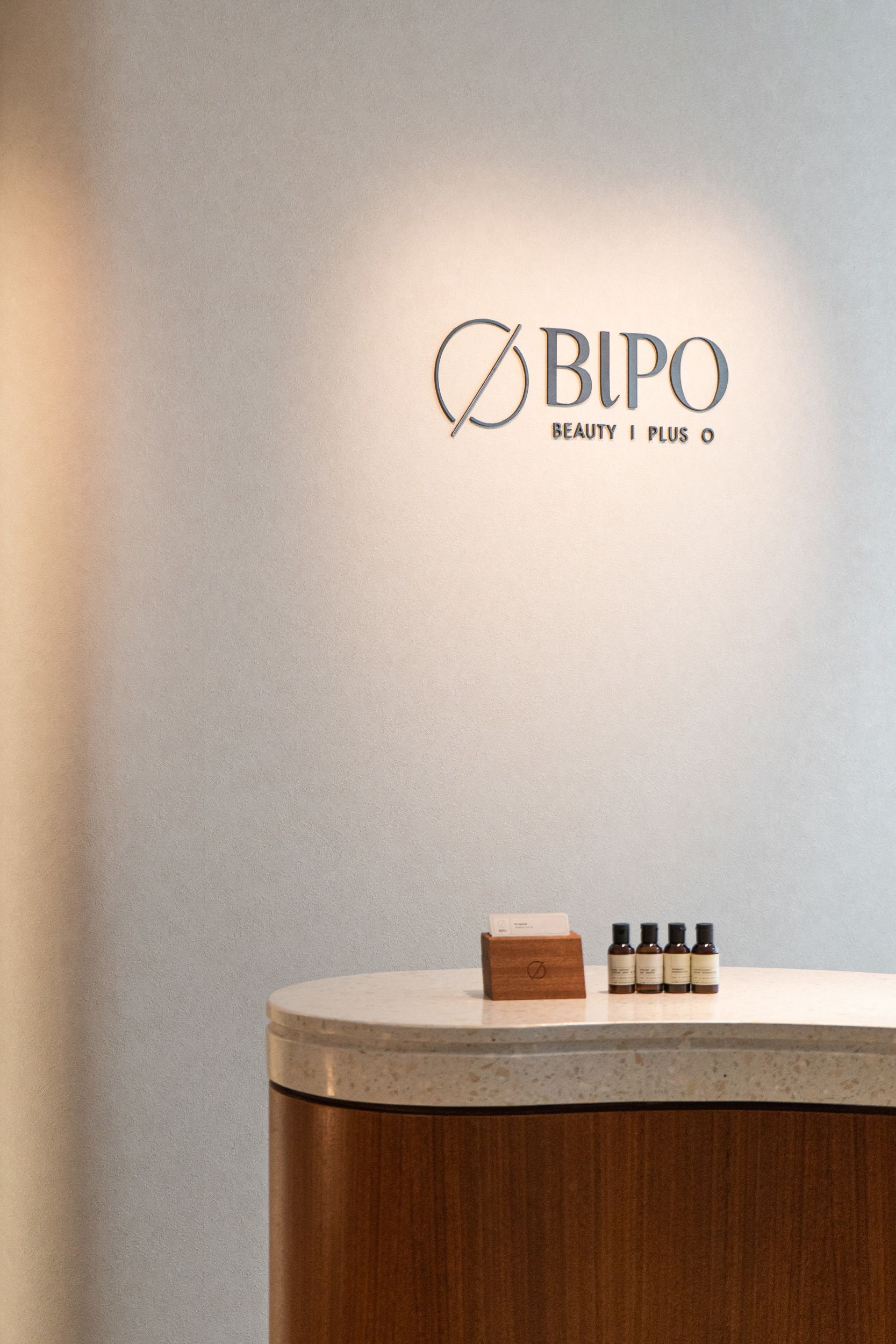
The brand identity of BIPO emphasizes on the connection between inside and outside, illustrating how beauty and health from the inner and outer self are interrelated as a cycle. It also symbolizes the beauty and healthcare service that BIPO provides from the inside out and the outside in for its customers.
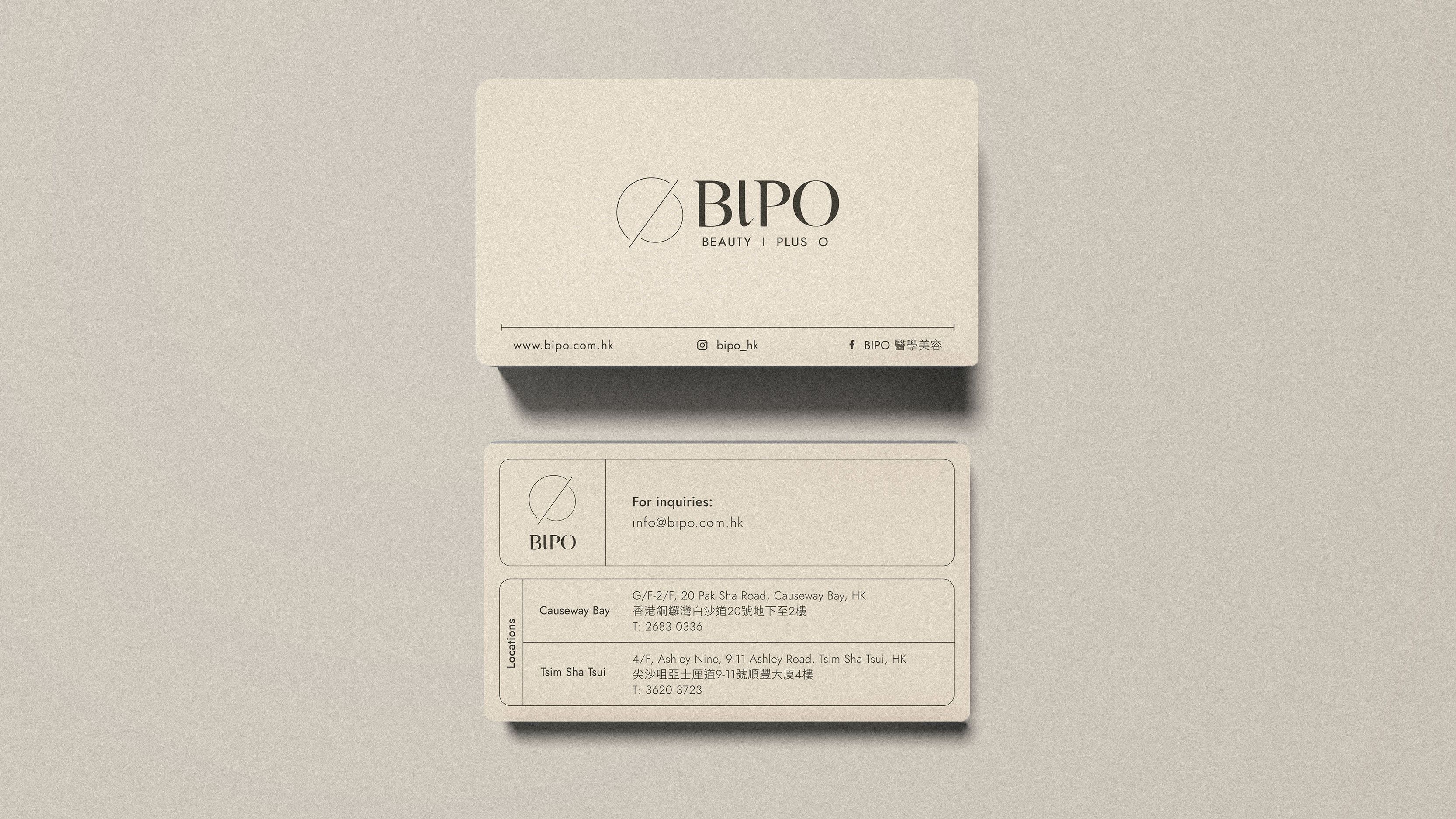
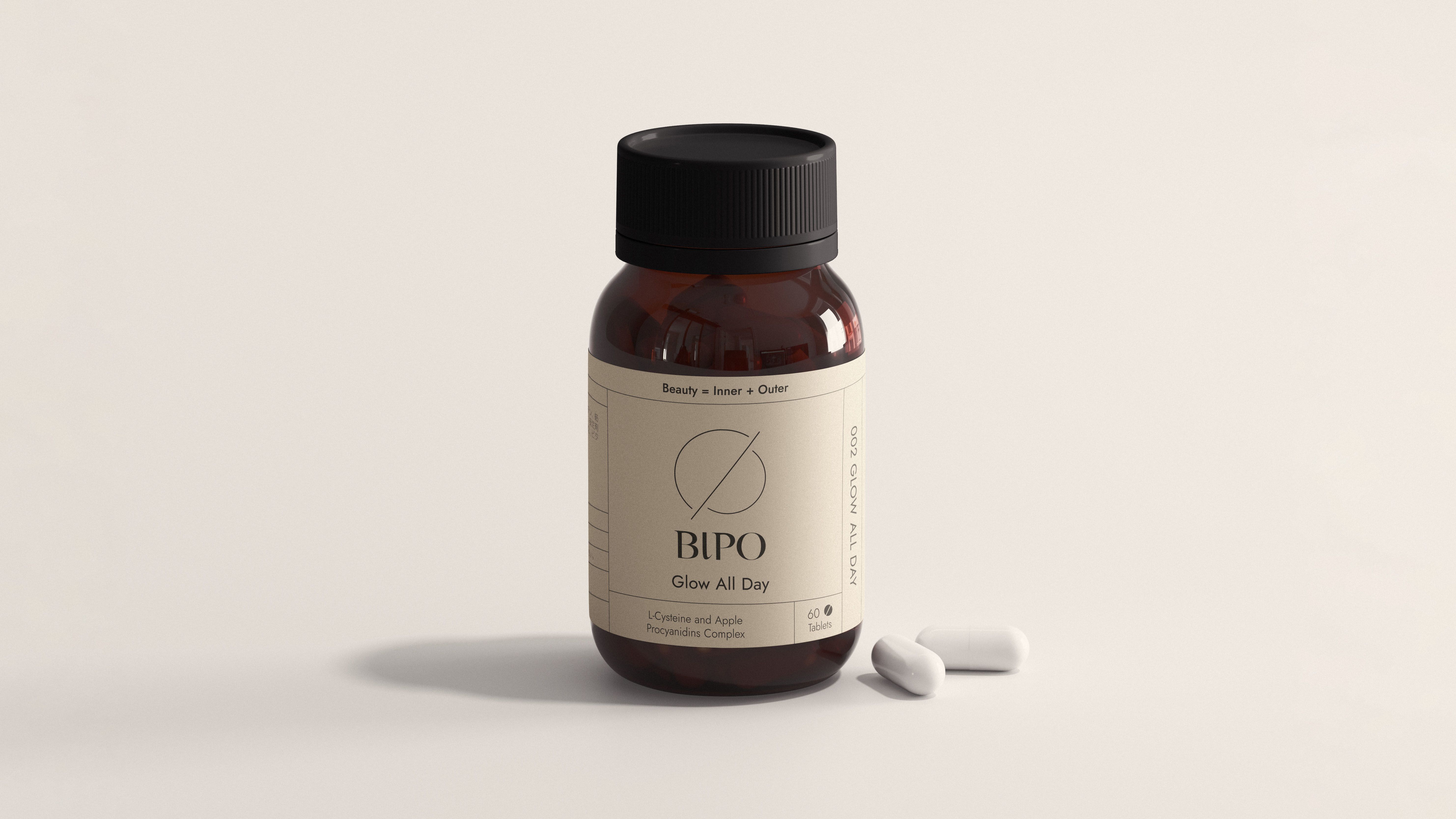
Inspired by the fluidity of water, the brand logo is a simplified modern serif logotype with a little tweak on each character. A contrast of two different line weights is used to resemble the dynamic motion of floating in and out. With a clean line logo symbol that symbolizes the transformation of beauty by cleansing from the inside out and outside in, it creates an intriguing contrast yet a refreshing image for the logo lockup.
