CrewCoffee Shop
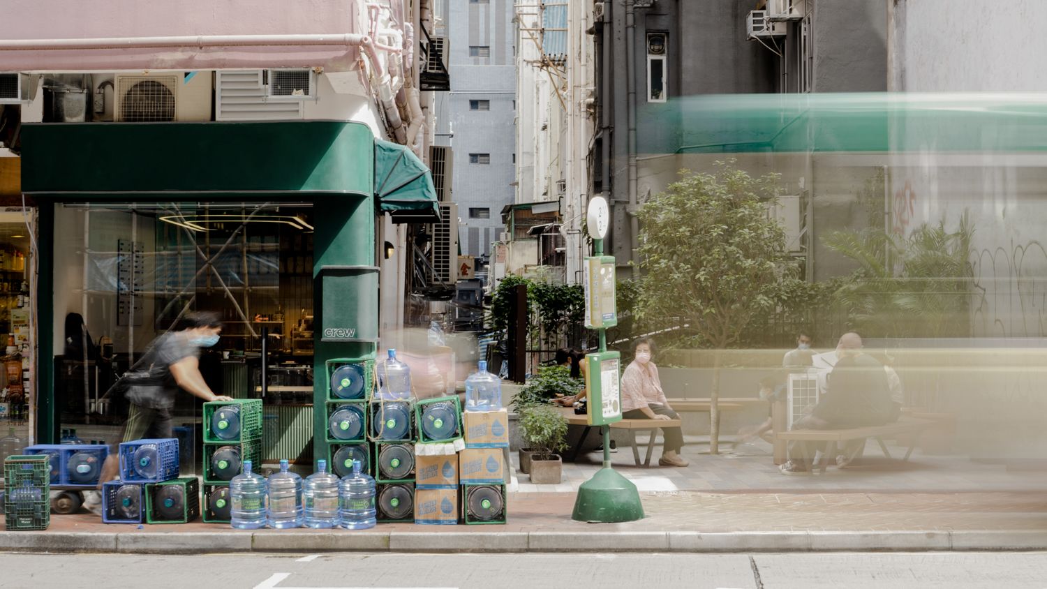
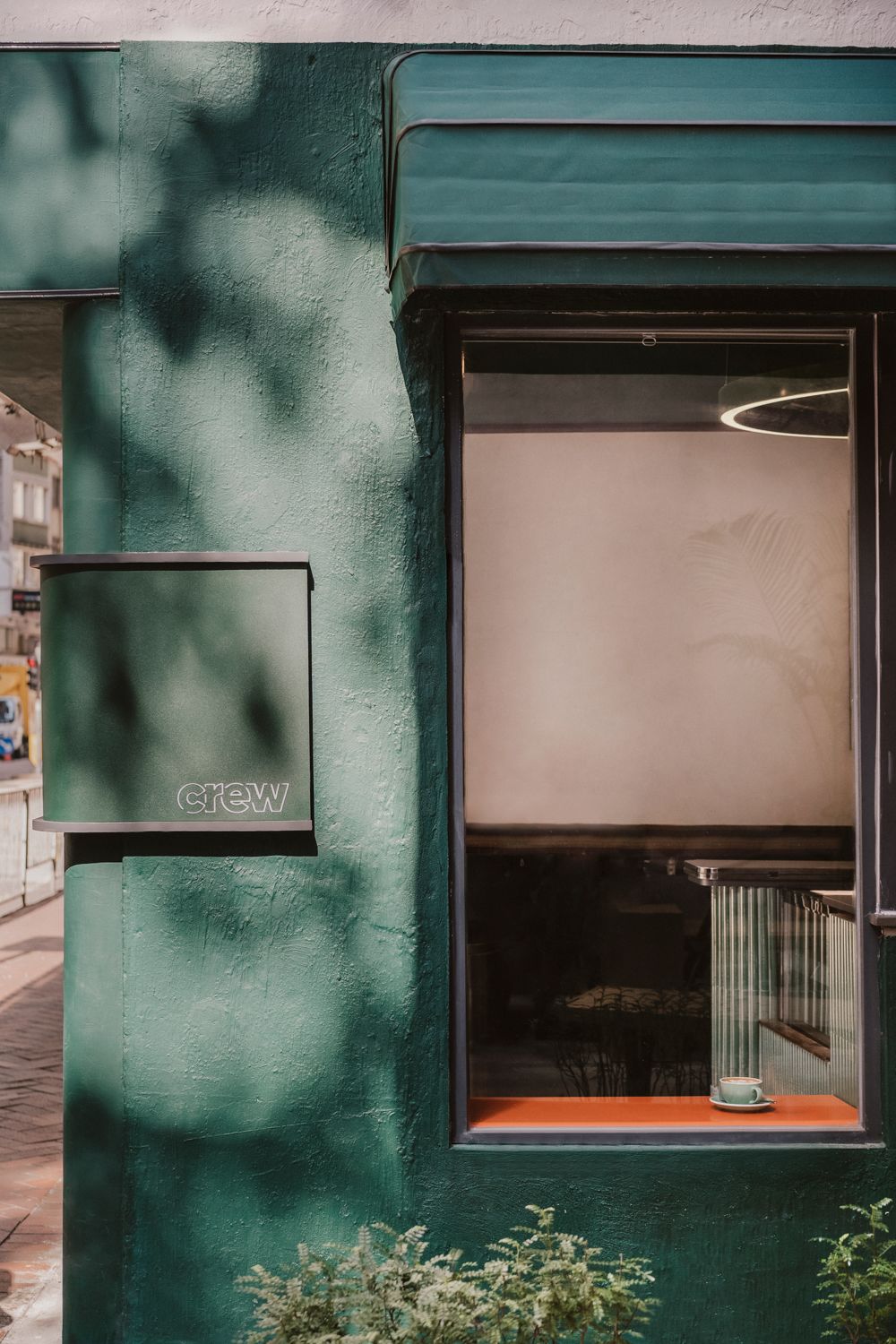
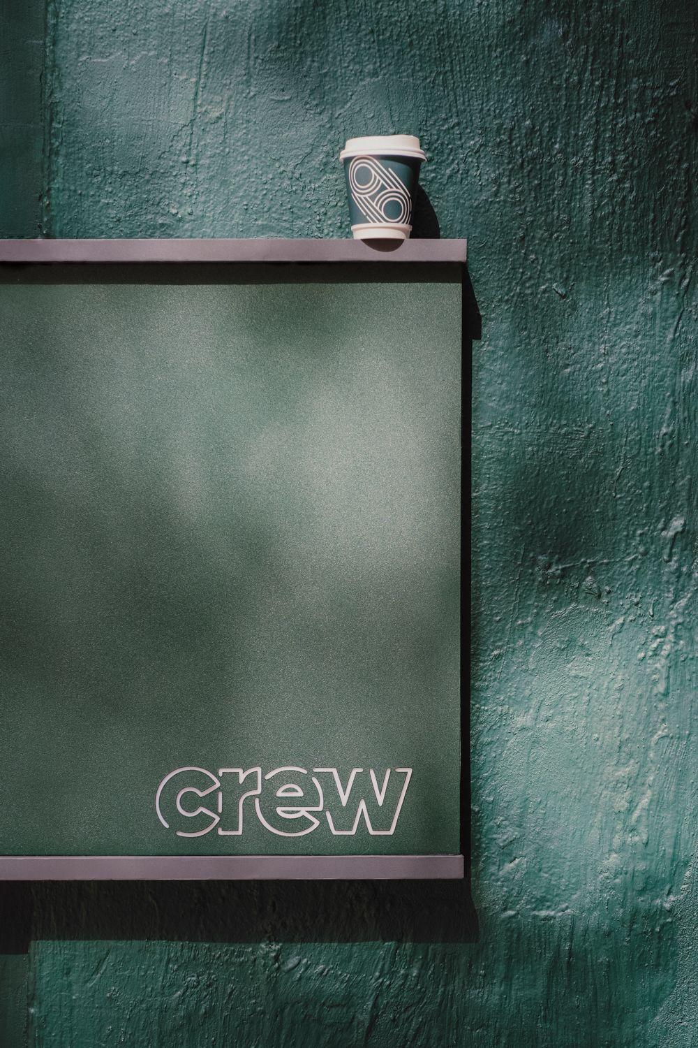
Located along a bustling street in Wan Chai, Crew is a vibrant day-to-day coffee shop that aspires to become the mini oasis in the neighborhood. Soothing shades of forest green are applied across the interior and exterior of the shop, extending the calm and relaxing atmosphere to the adjacent pocket park for hanging out.
By strategically opening up the outer wall with a large pane of glass and a takeaway window, baristas can easily communicate with customers in the park. At Crew’s corner, interactions between people, coffee and life matter most.
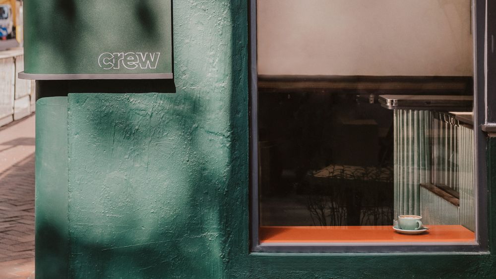
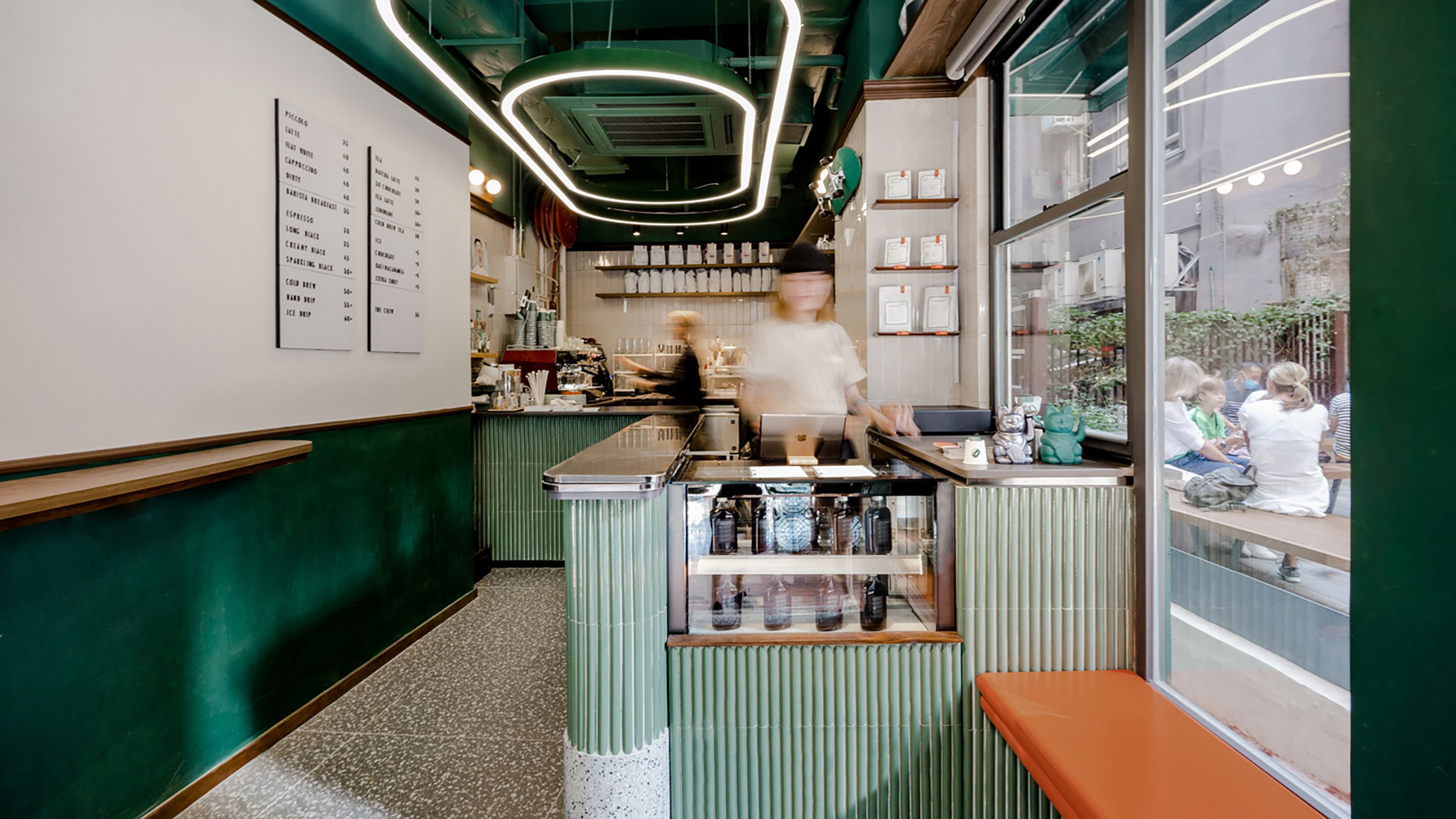
A long bar with the maximized length for the servicing of baristas is deployed, creating an intimate spatial configuration that favors close contact with customers. The overall colour palette revolves around different shades of green and ivory, with nutty orange popping up occasionally. Customers can alternatively perch on the side bench near the glass window. Lacquered in vivid nutty orange, the side bench adds a vibrant touch to the interior and the park.
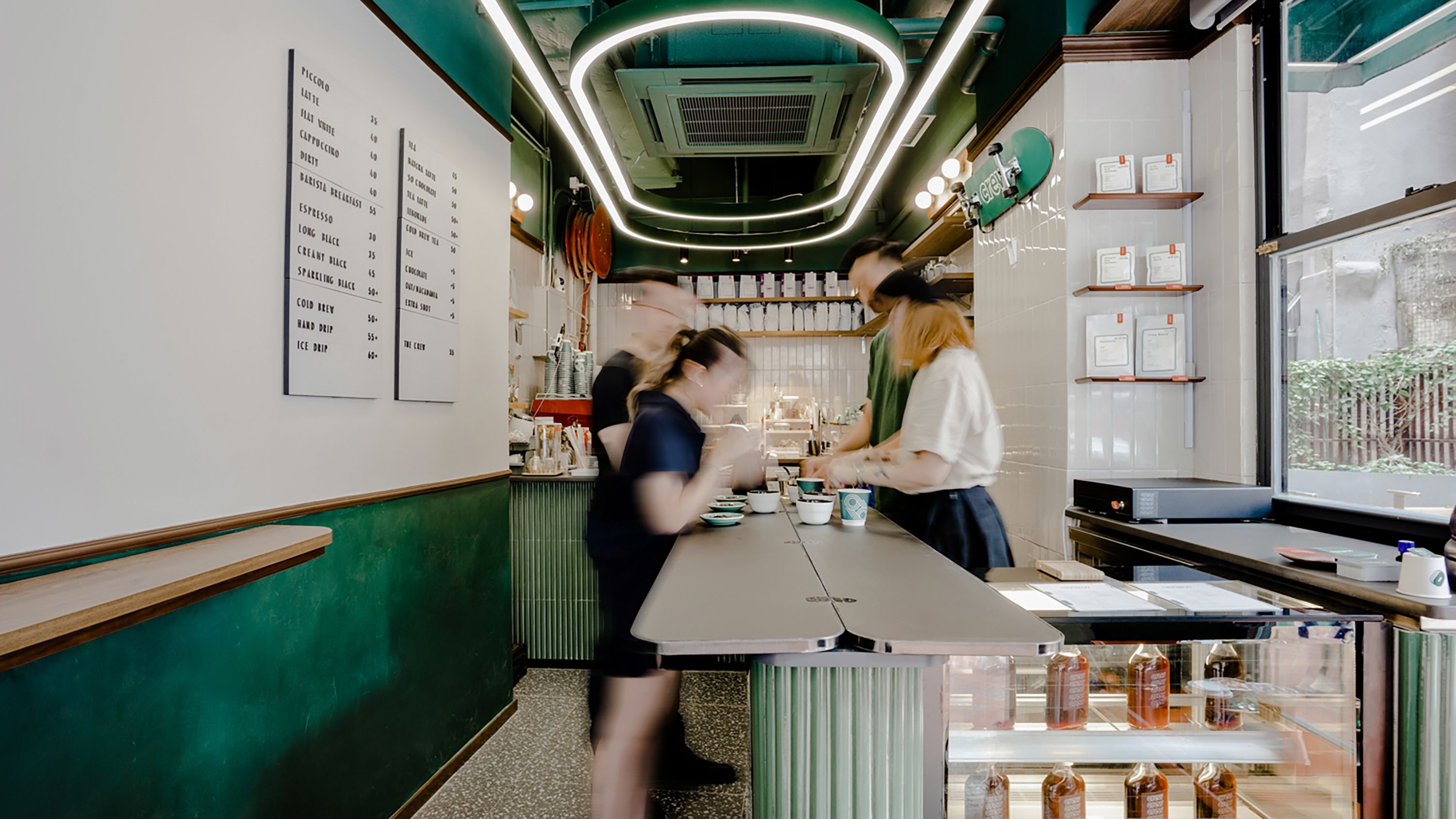
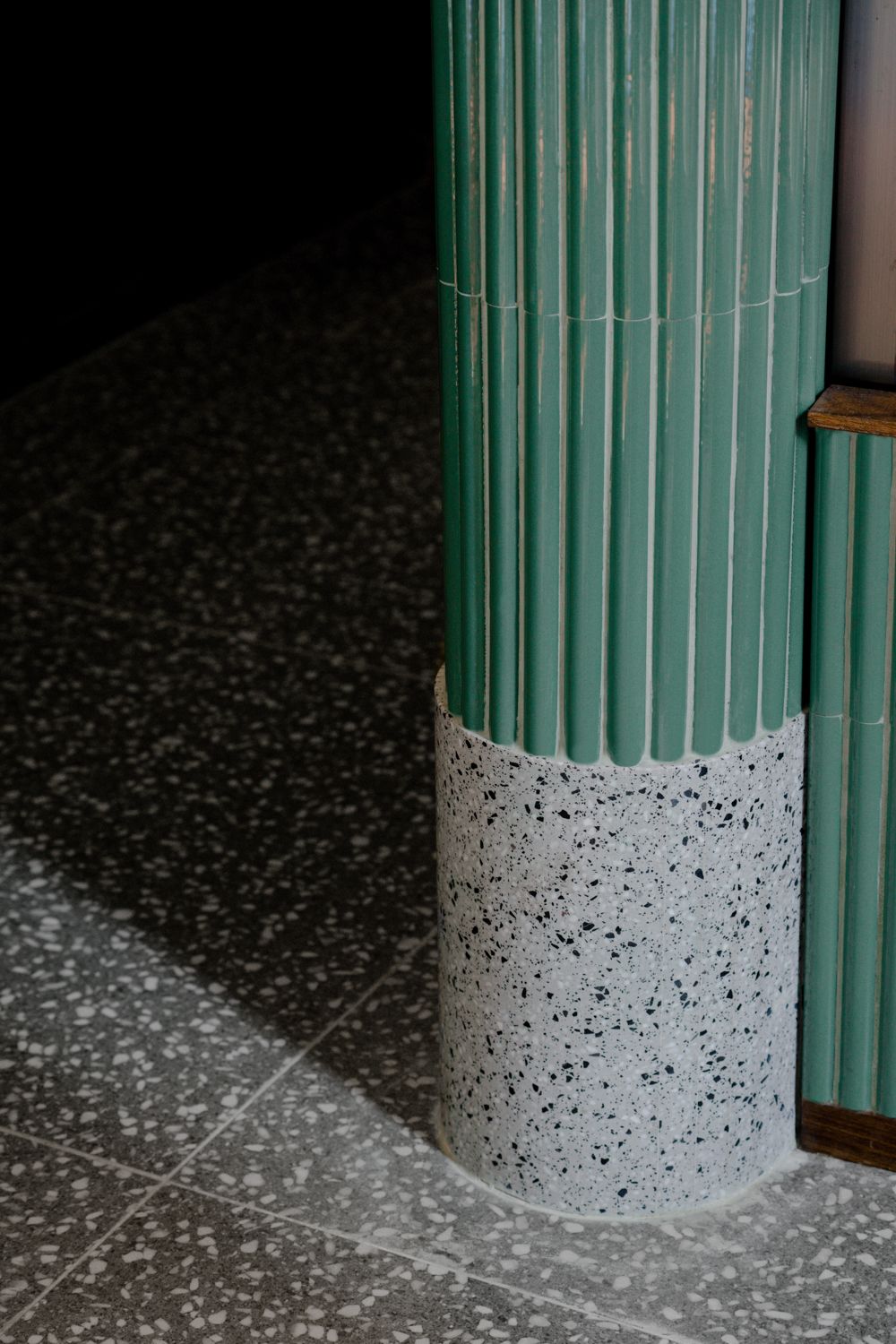
Two running track-inspired ceiling lights are hung above the space to reinforce the brand identity while defining a unified space between the barista area and the customer area. Semi-gloss green fluted ceramic tiles are installed across the bar counter. Topped with black aluminium sheet, the bar table can be extended and transformed into a cupping table for coffee tasting workshop. The lower part of the bar table is wrapped with a thick speckled grey terrazzo foot rim and then extended to the floor, emulating a pebble stone road across the shop.
The choice of materials and colours, as well as the shop's connection to the urban park, made Crew the oasis of serenity amidst the bustling city.
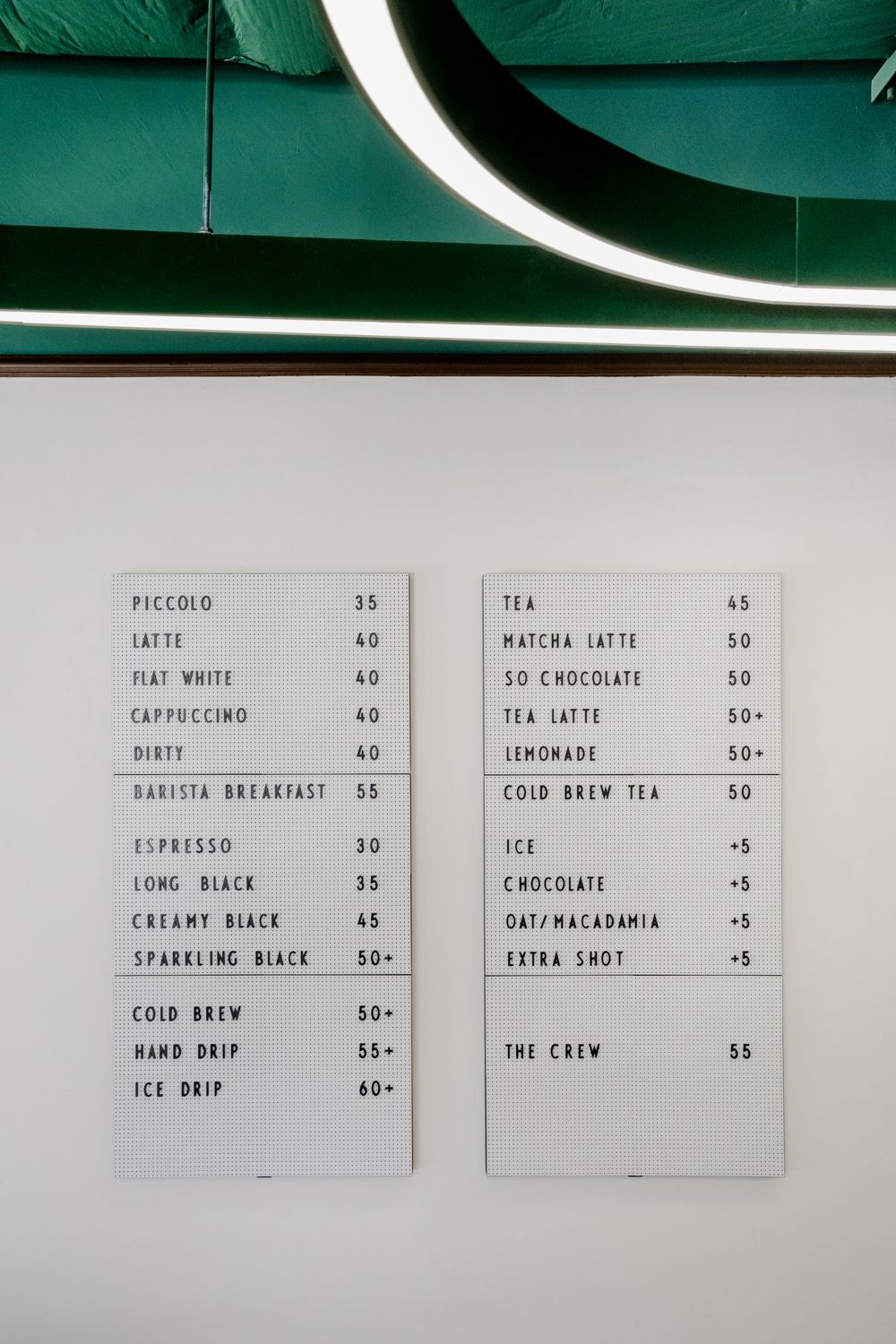
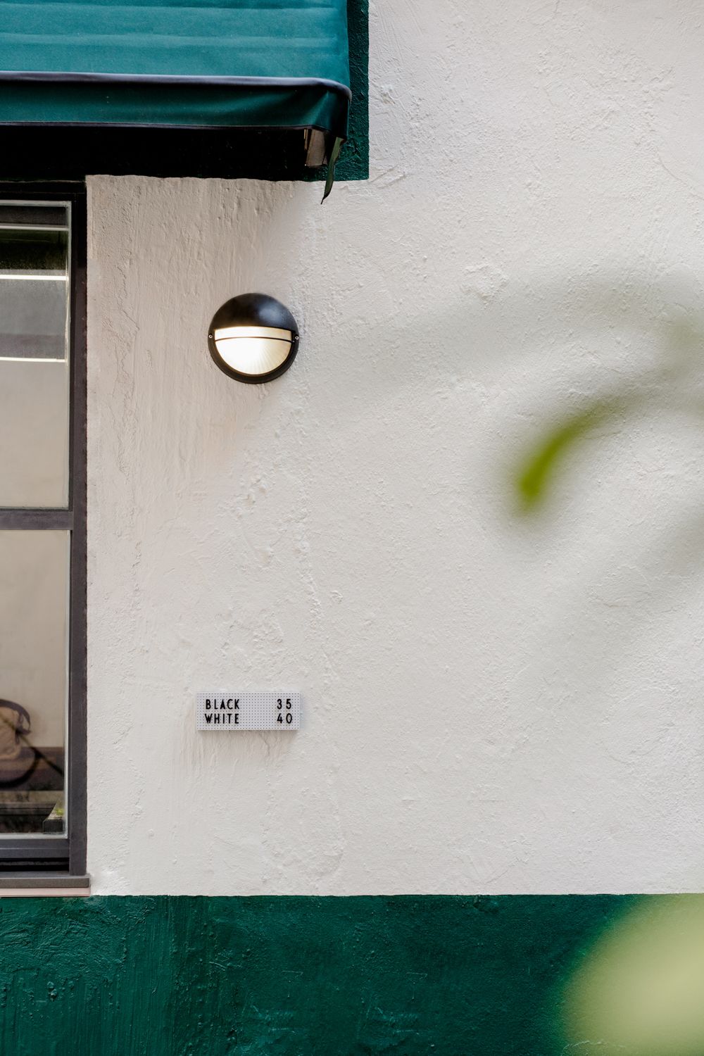
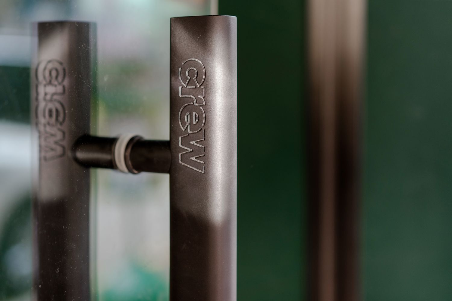
Brand Identity Concept
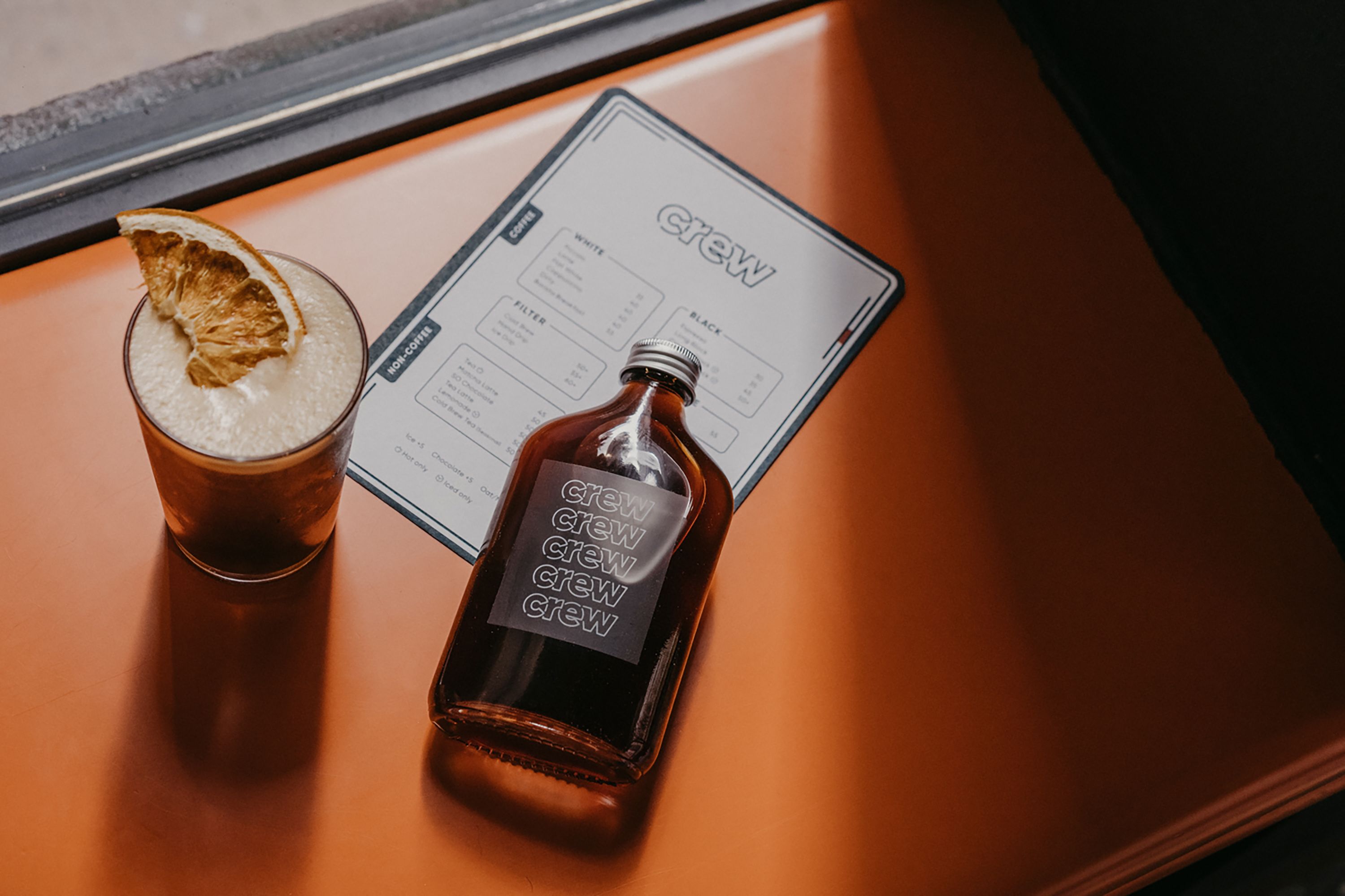
The brand concept of Crew is about the energy, spirit and bonding of a sports team that fights towards one goal, just as people working closely together as a crew. Its visual identity is delivered through circles and parallel lines, forming tracks and paths that resemble everyone’s journey in life; walked differently yet crossing each other’s.
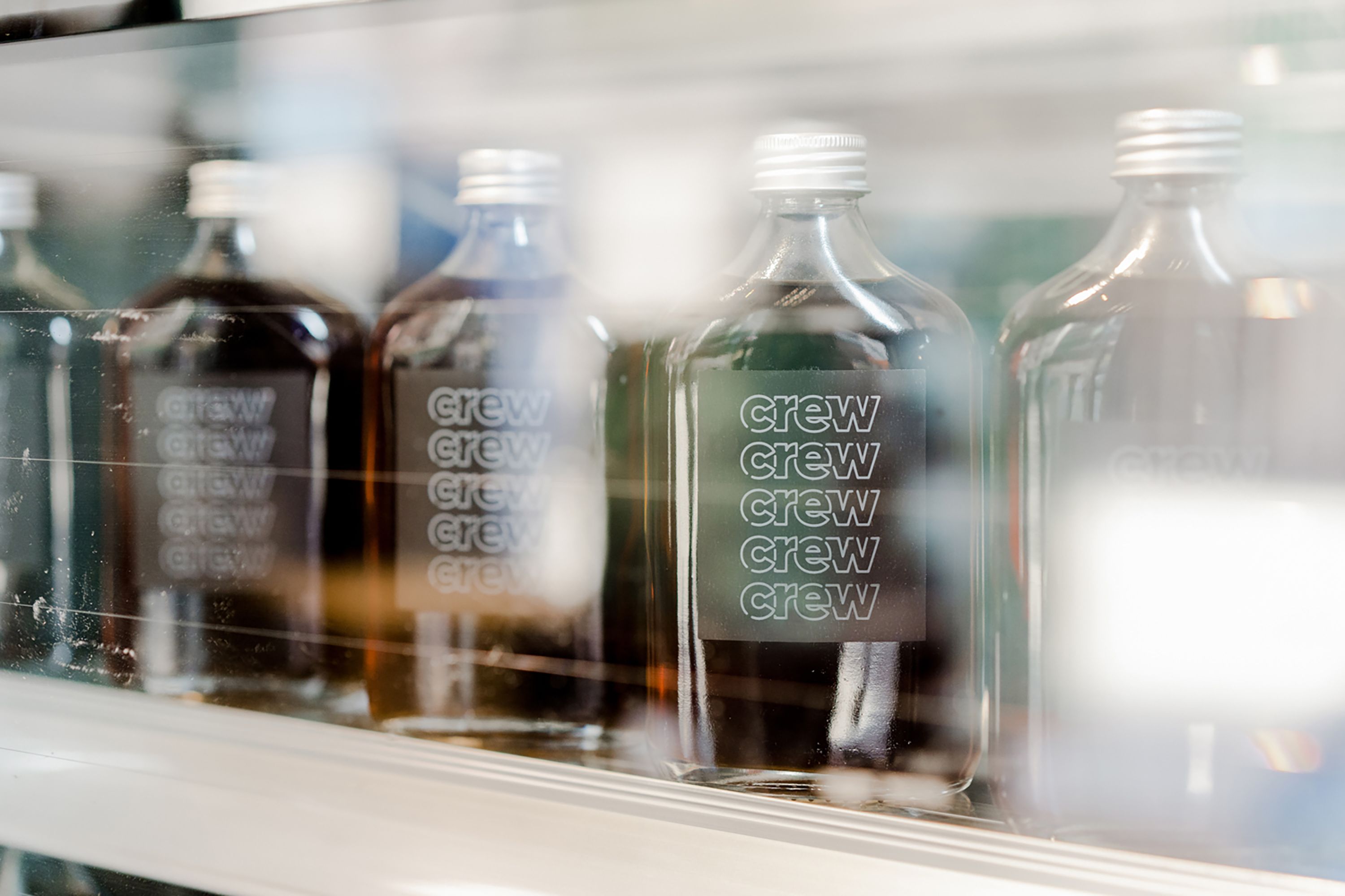
The type logo plays with a bold in-continuous outline to reinforce the concept of energy, dynamics and interactions. The outline associates strongly with the concept of tracks and paths, which plays well as the holistic design language along with the other visual elements. Through movements created by rhythmic lines, the logo speaks for the fun and playful side of Crew. Compensating of the gaps between the rhythmic lines, the tracking of the letters are tightened to create a feeling of staying close together.
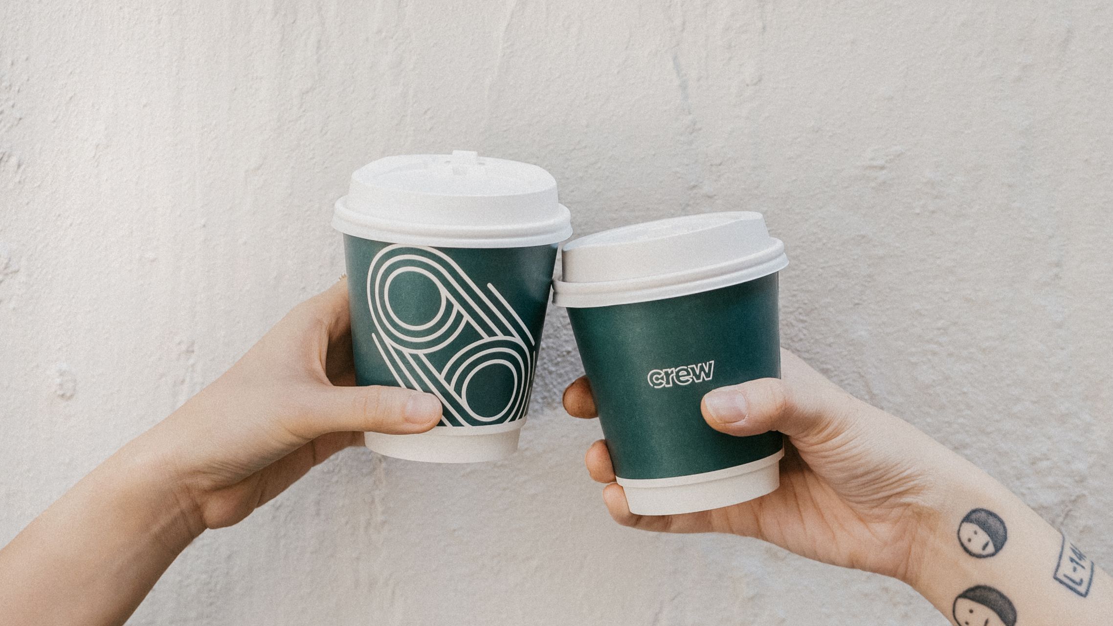
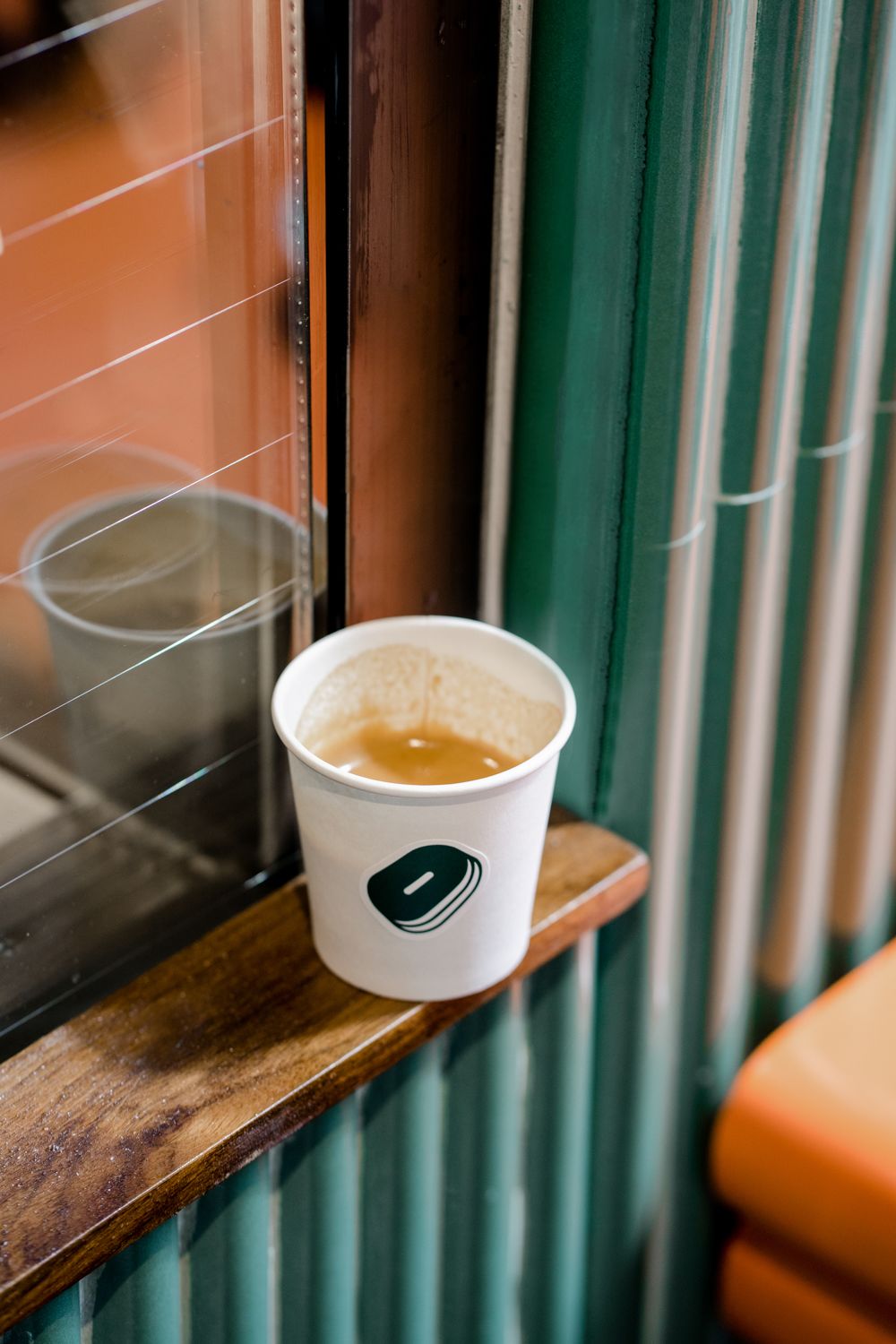
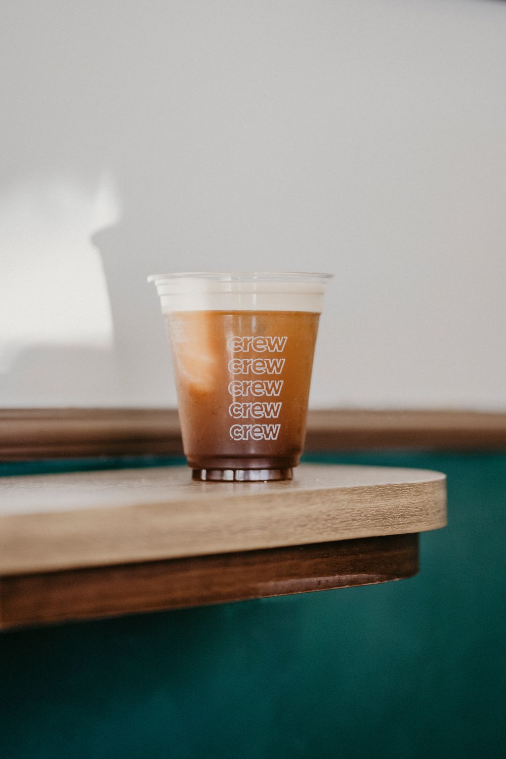
The graphical composition of parallel lines symbolizes movement, as well as side-by-side support among peers. The crossings represent huddles among friends and connections with new ones. Brewing at the heart of a multi-cultural community in Hong Kong, Crew hopes to become part of customers' daily routines and offer space for all kinds of interactions and conversations.
