HanchaTea Shop
Nestled away from the city centre, HanCha becomes a sanctuary for escaping from the hustle and bustle and indulging in a moment of serenity.
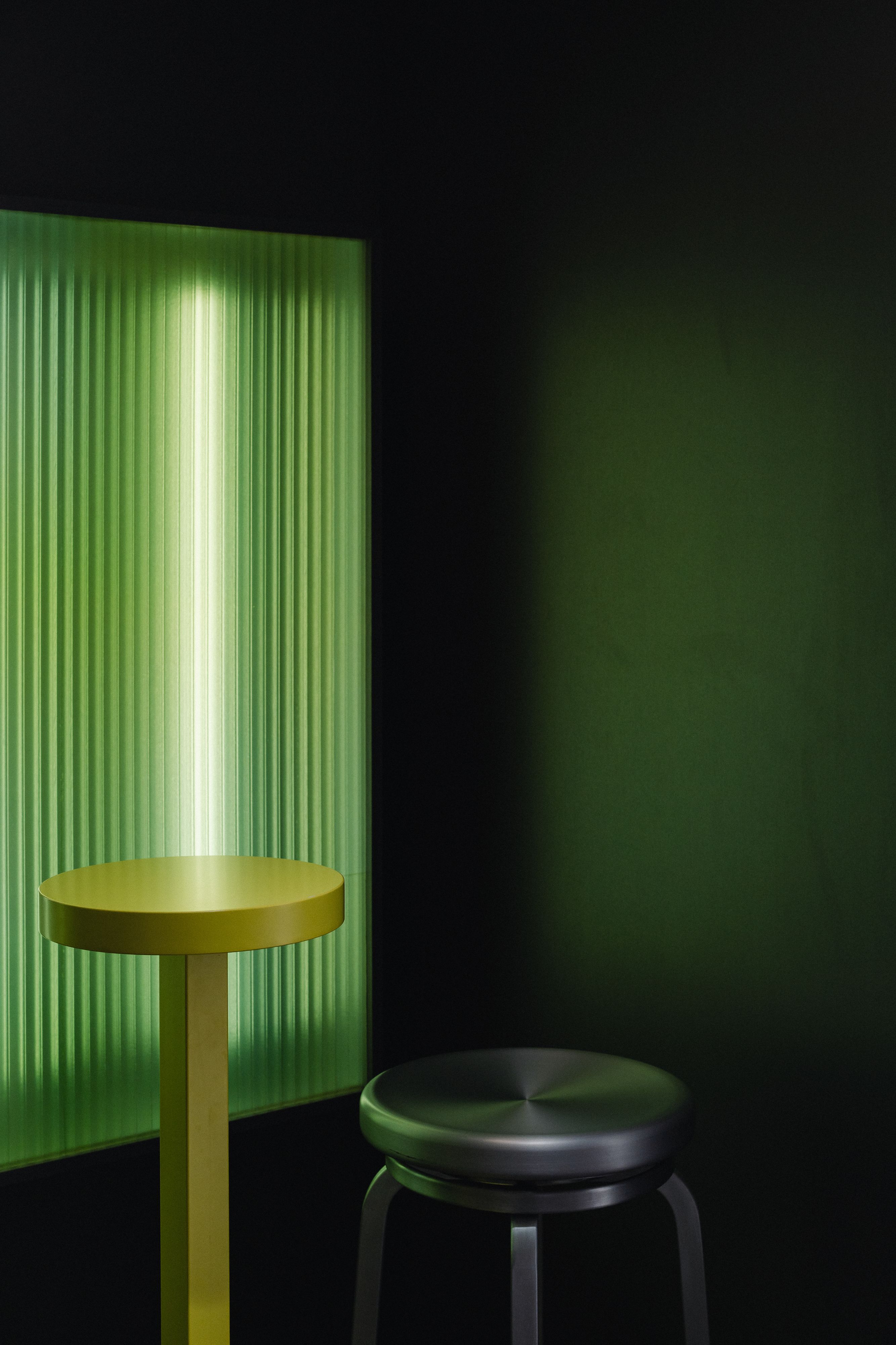
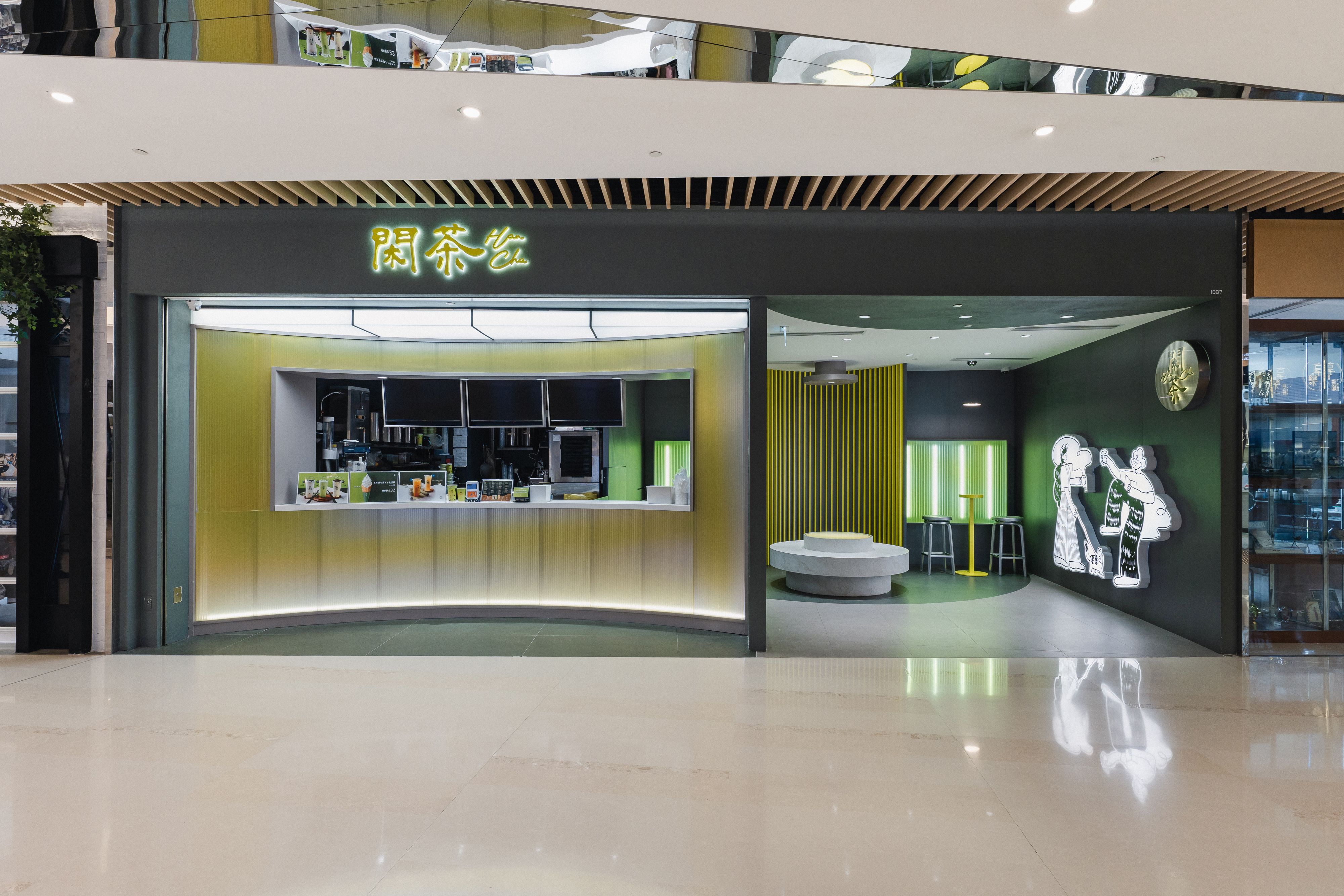
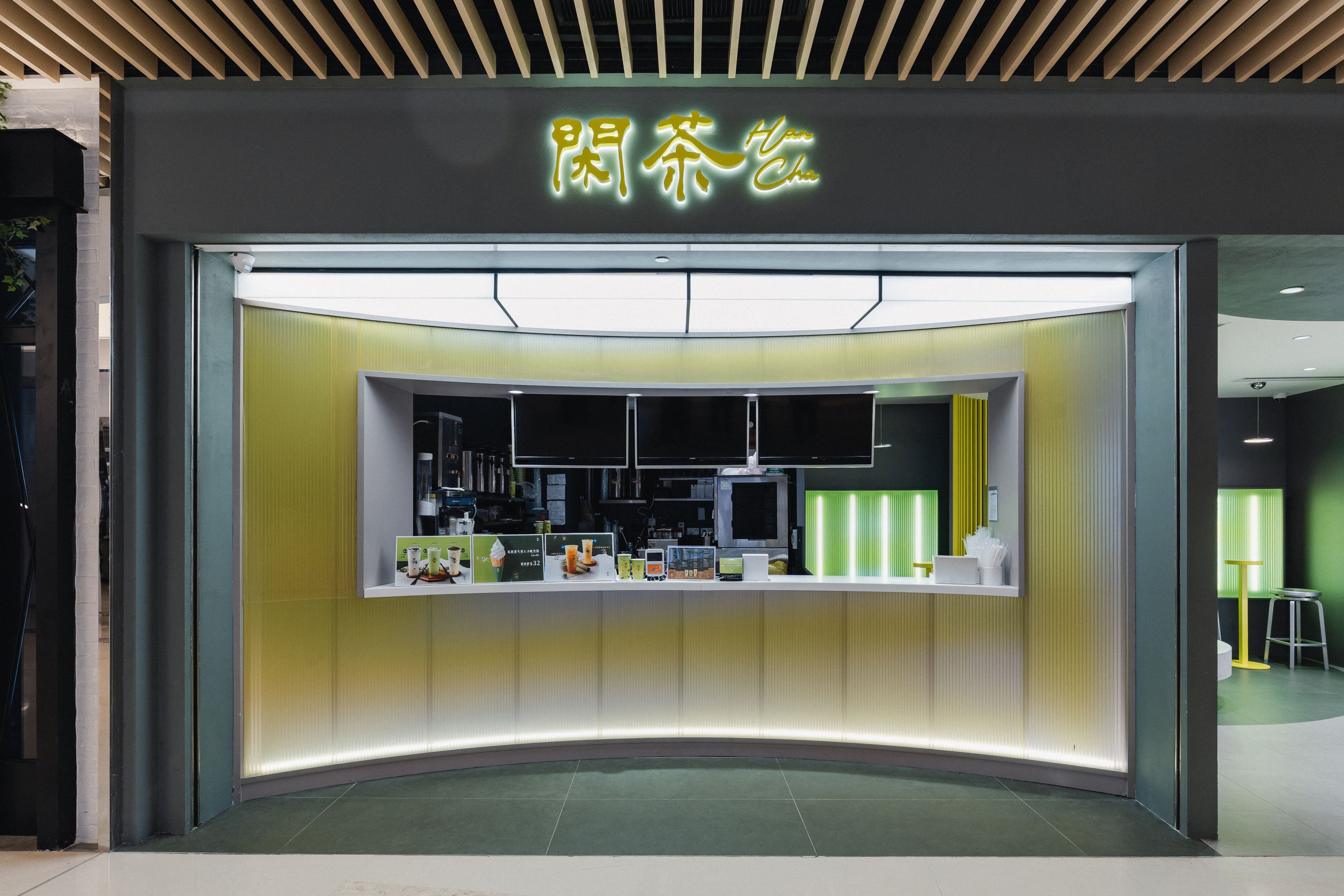
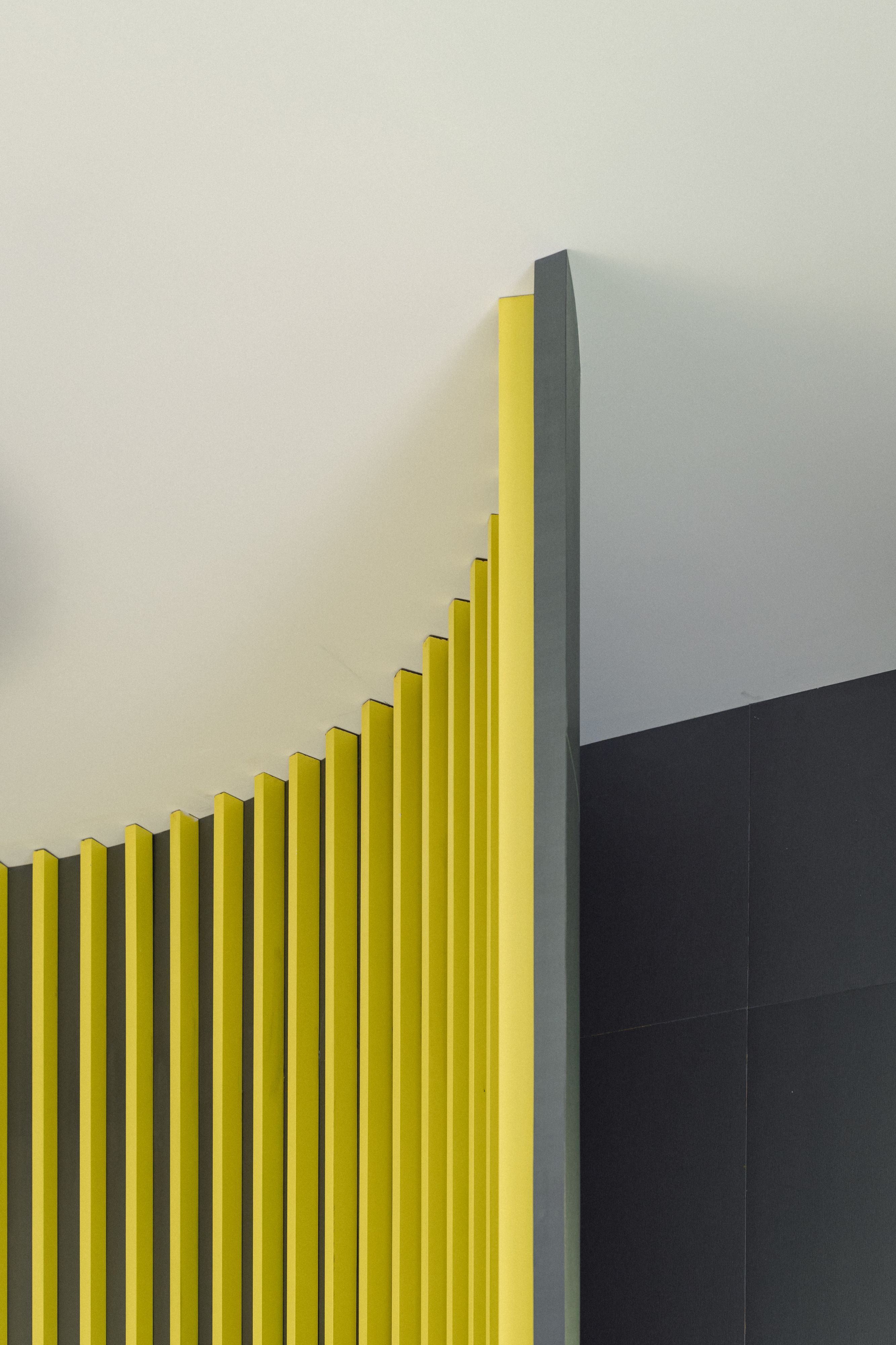
HanCha pops out from the surroundings with the bold usage of colors while not flamboyance. The interior space is curated in a manner with simplification and the harmonious of materials and the tone of colors.

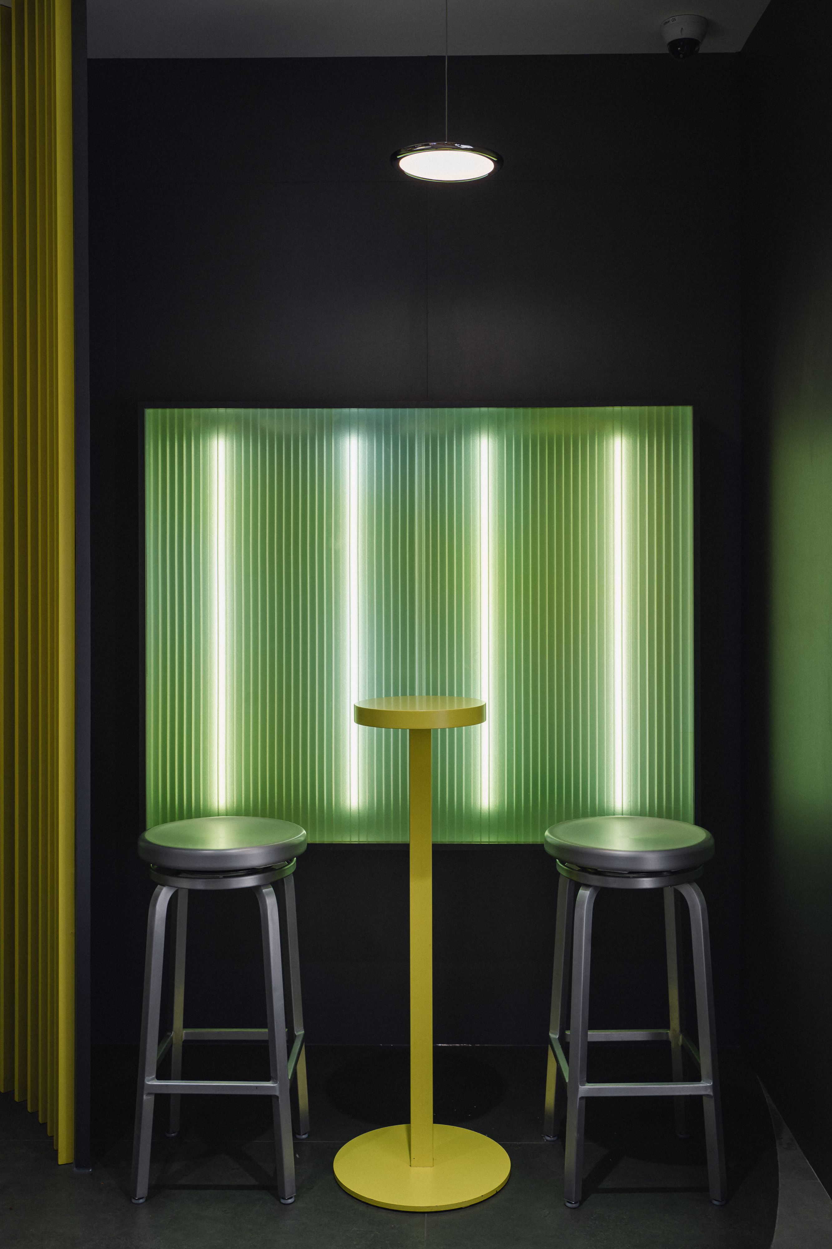
Shop front divided into two parts where are the ordering counter and an area for dine-in. Scintillating execution of the curvatures create a sense of enclosure, submerging oneselfinto the space. The mesmerizing visual effects of the scattered lights and colors mimics the capture of motion, evoking the moment of pause and the timeless ambience.
Abstracting from the brand colors, matcha green filled walls together with the embellishment of the fading green and yellow evokes a feeling of tranquility and serenity.

BRAND IDENTITY CONCEPT
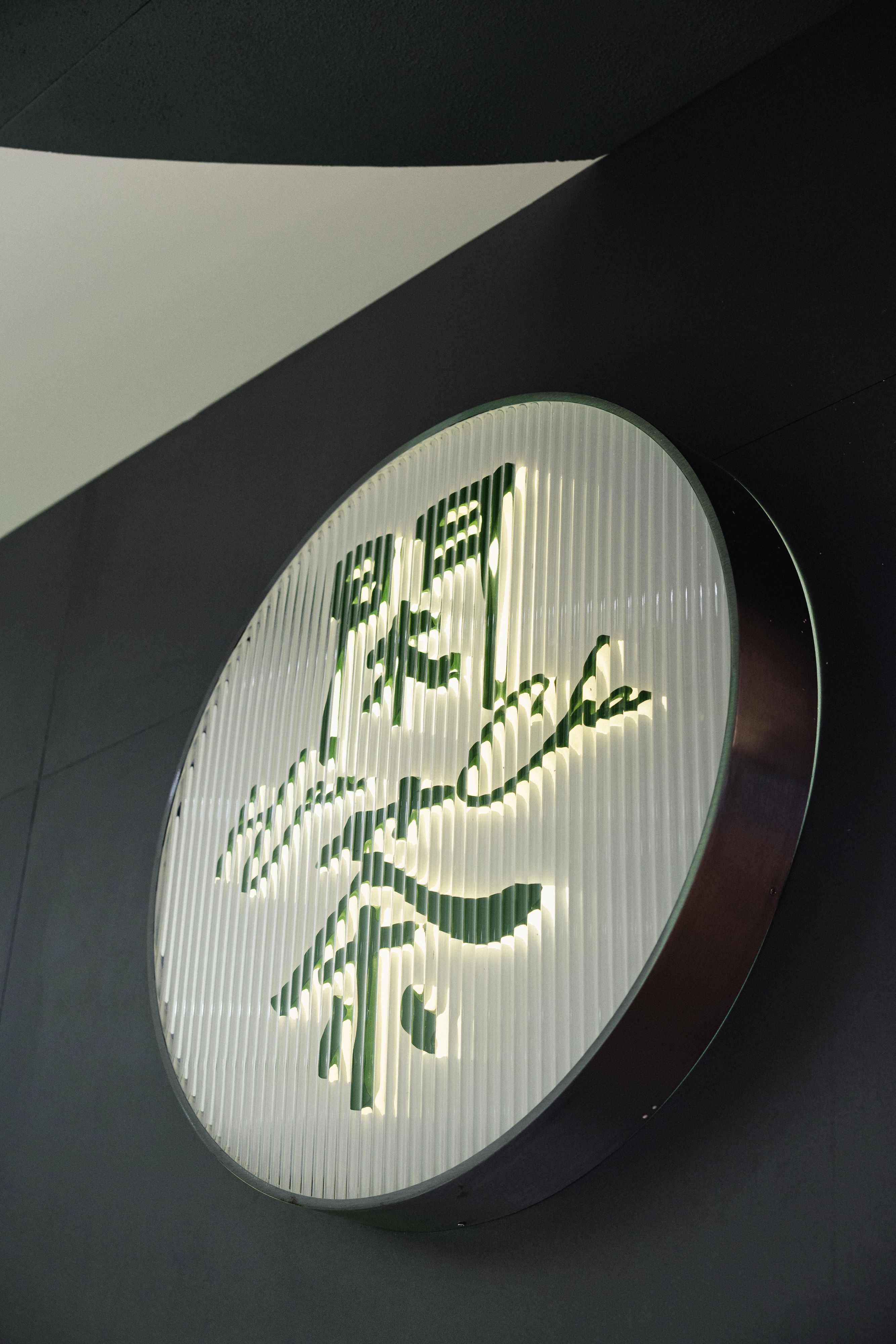
The name “閑茶” holds significant cultural and linguistic meaning.
“閑” represents tranquillity, leisure, and a sense of calmness. It embodies the idea of finding solace and relaxation in the midst of a busy world. “茶” signifies tea, a beverage deeply rooted in traditions and known for its soothing properties.
Together, “閑茶” creates a name that evokes a serene and peaceful ambiance,
inviting individuals to take a moment to pause, unwind, and indulge in the timeless pleasure of tea.
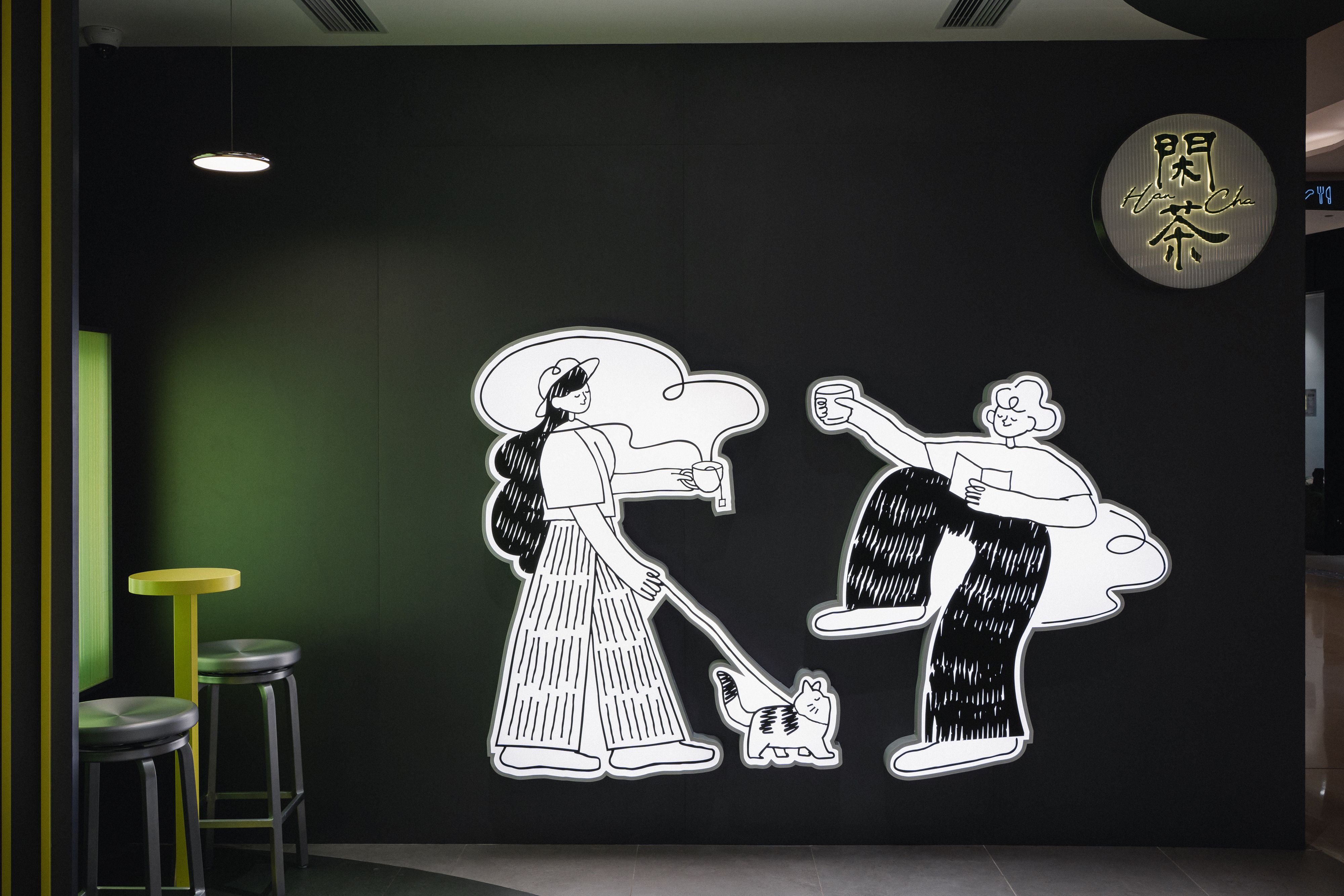
Steeping
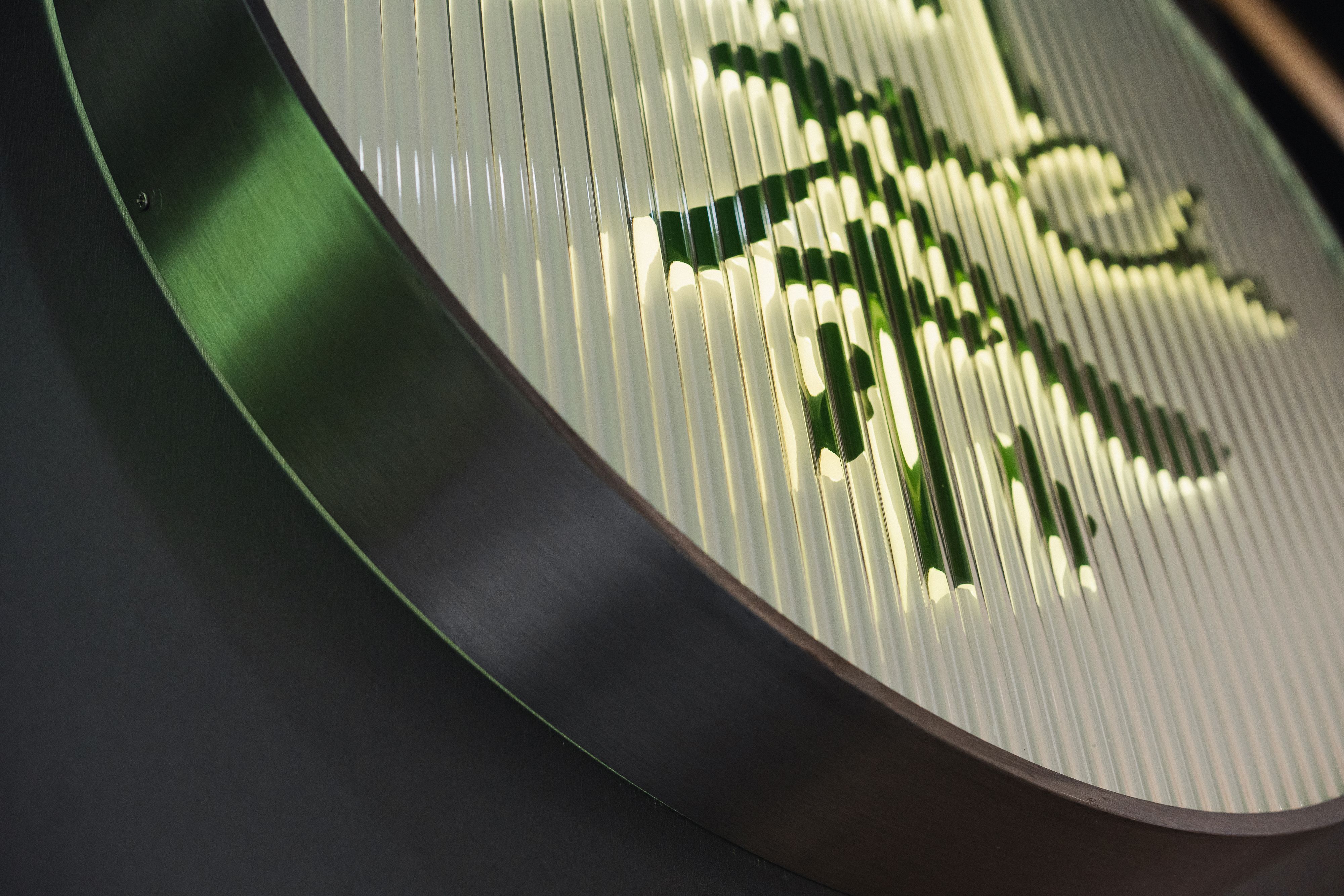
Drawing inspiration from the process of steeping tea, our concept embraces the idea of the trail of inks, symbolising gradual transformation and infusion of flavours as tea leaves unfurl.
Executed by incorporating elements of blurring and fading in the visuals, representing the changing colours and gradual development of flavors during the tea brewing process.
