MorokokRestaurant & Bar
Recognition:
- Design and Build Awards 2019
- Excellence in Bar/Restaurant Design
- Sky Design Awards - Visual Design, Bronze
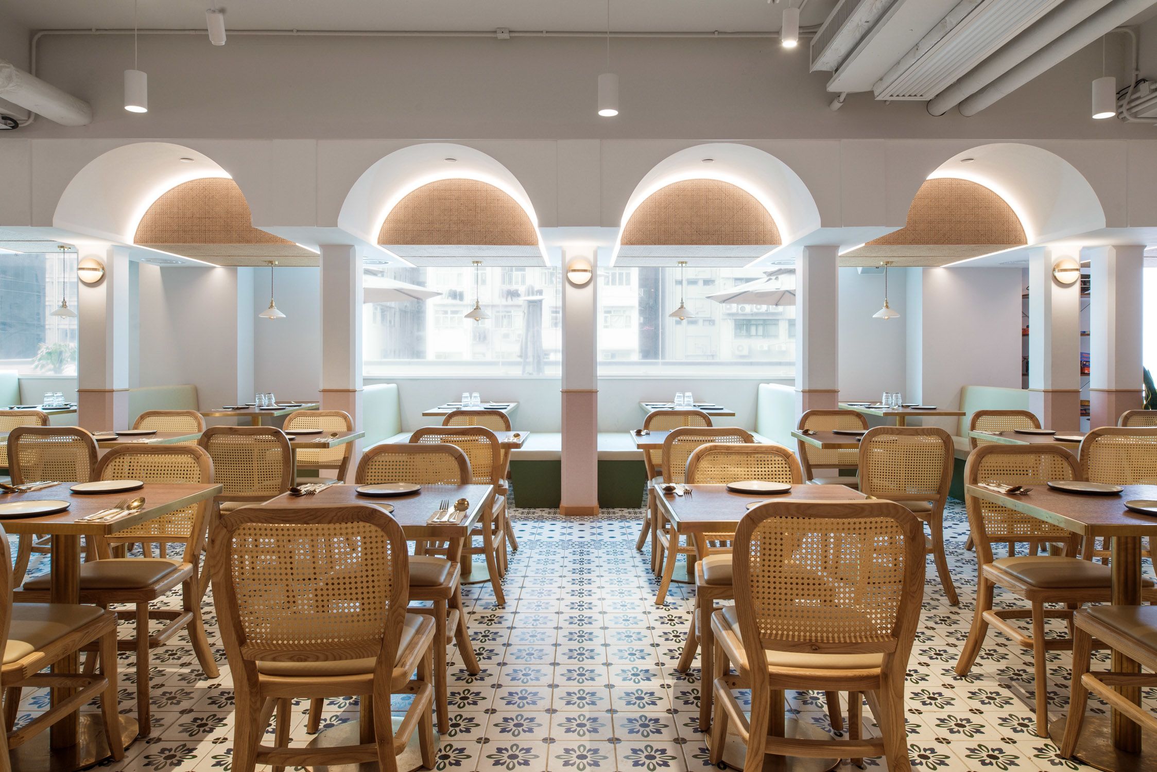
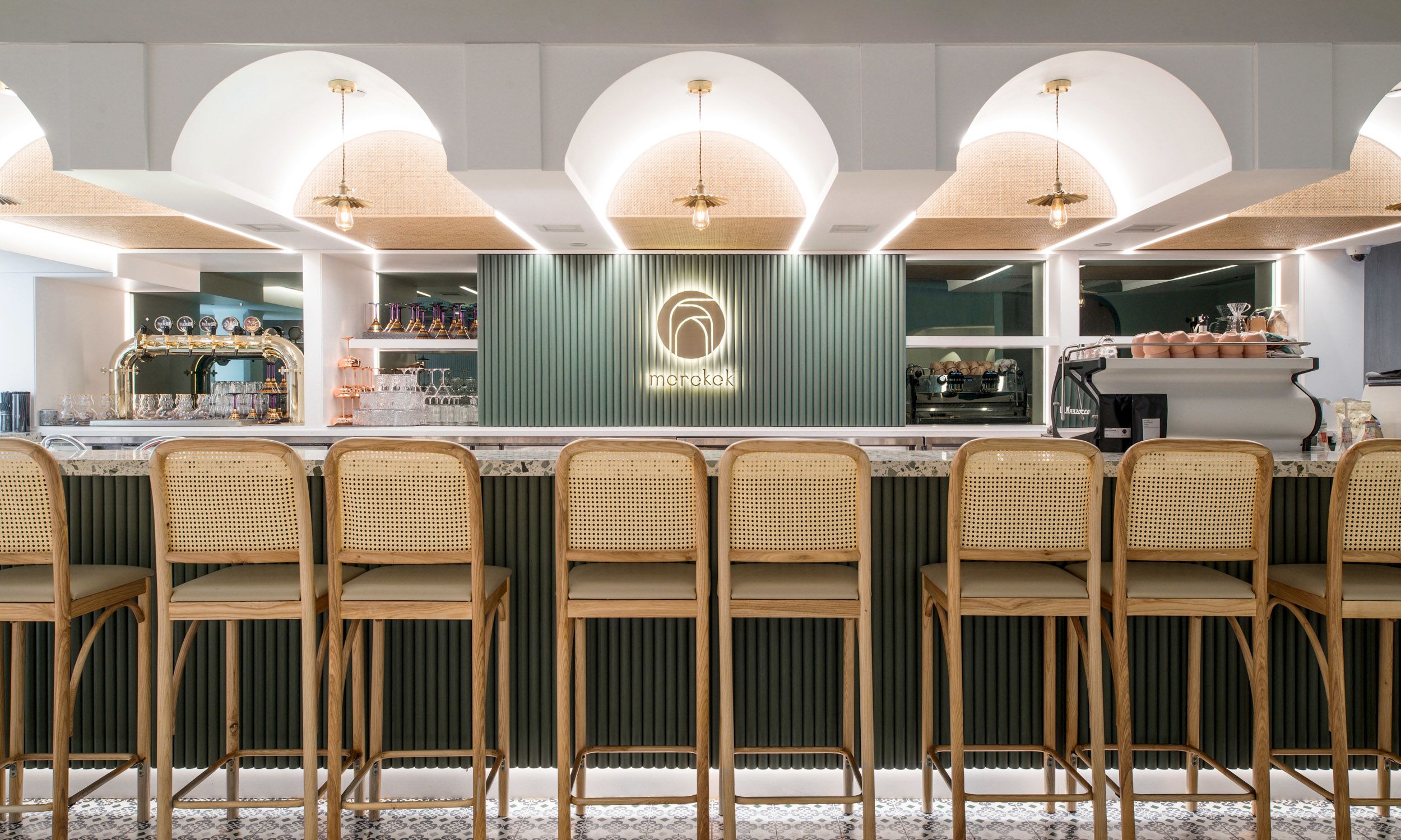
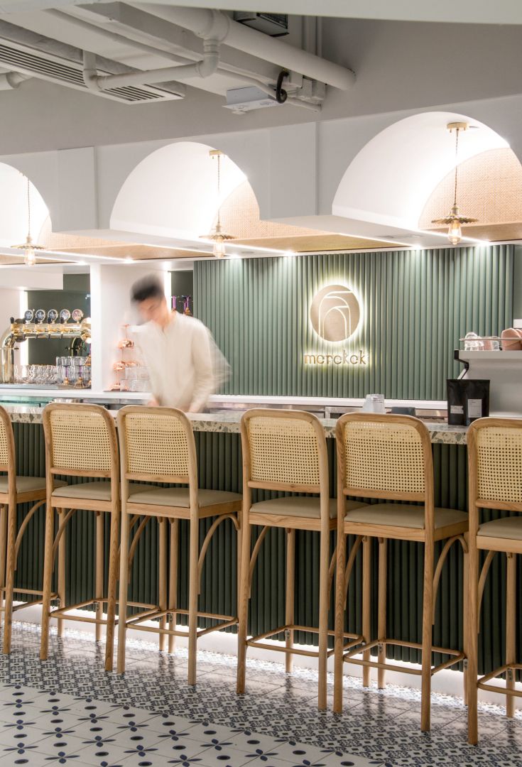
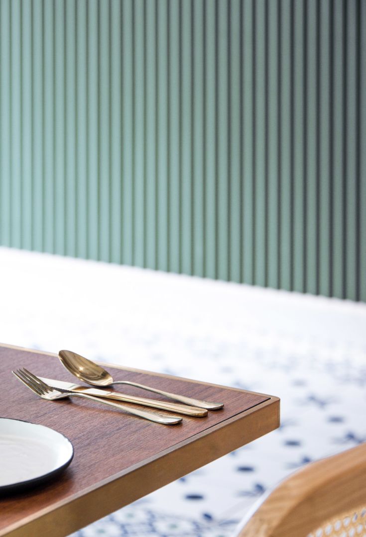
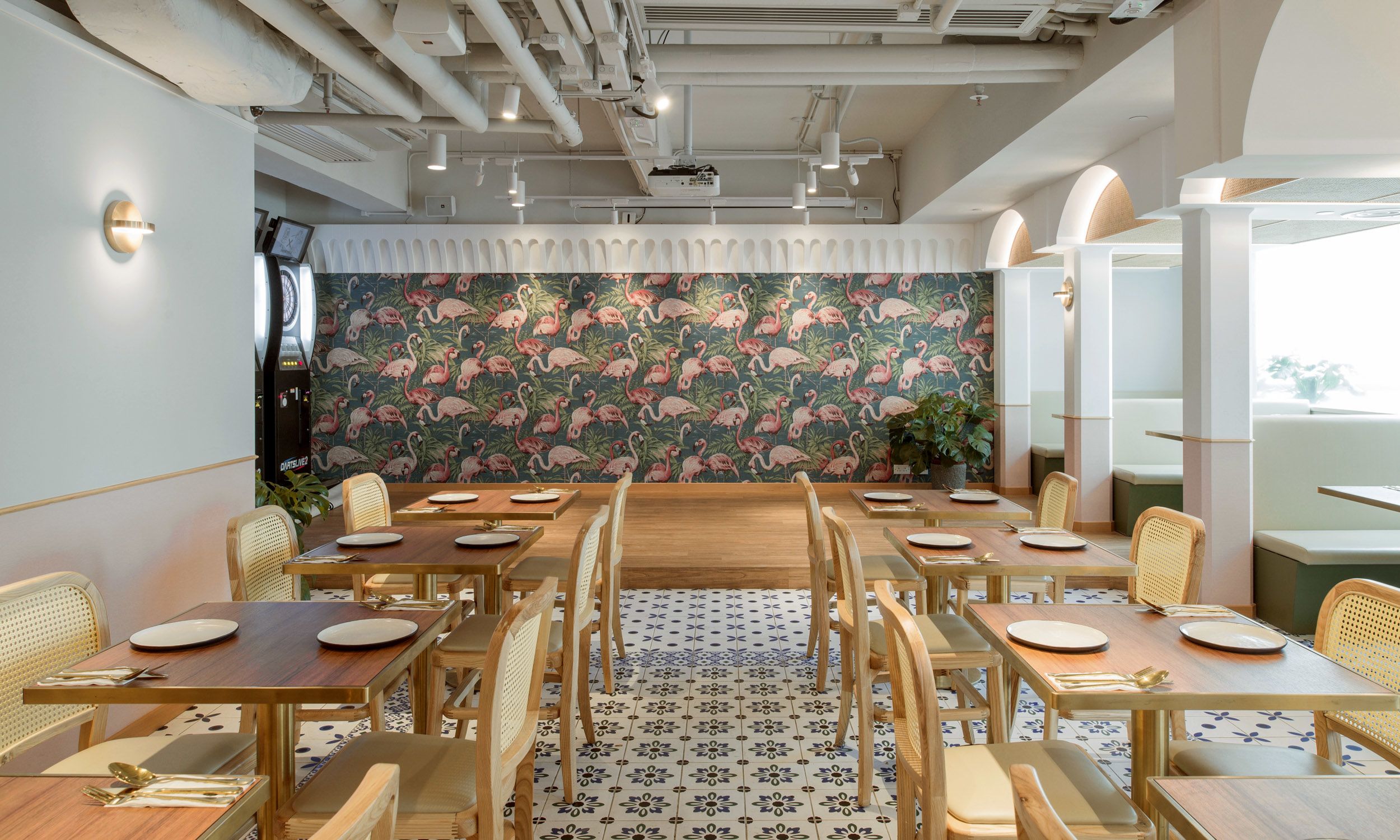
A vibrant bar and fusion restaurant in the heart of Hong Kong, Morokok puts together contemporary interpretations of Moroccan architecture and Mediterranean motifs, offering a surreal getaway in the city. The interior design highlights traditional Moorish elements including arches, distinctive colors, plants of various sizes and patterned flooring tiles.

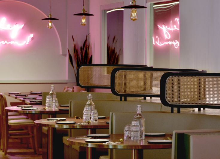
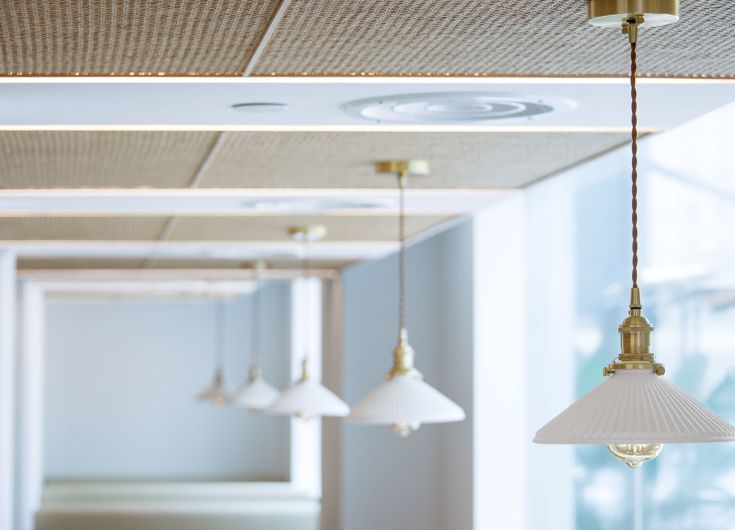
Upon arrival, one would be welcomed by palettes of white and green with a hint of brass. The play of light and shadow on the white abstracted arcade stretches the journey for stepping into the wonderland. The central dining area is defined by wood furniture, beech trimming, rattan surfaces, and a vaulted arch ceiling, further lightened up by pouring daylight.
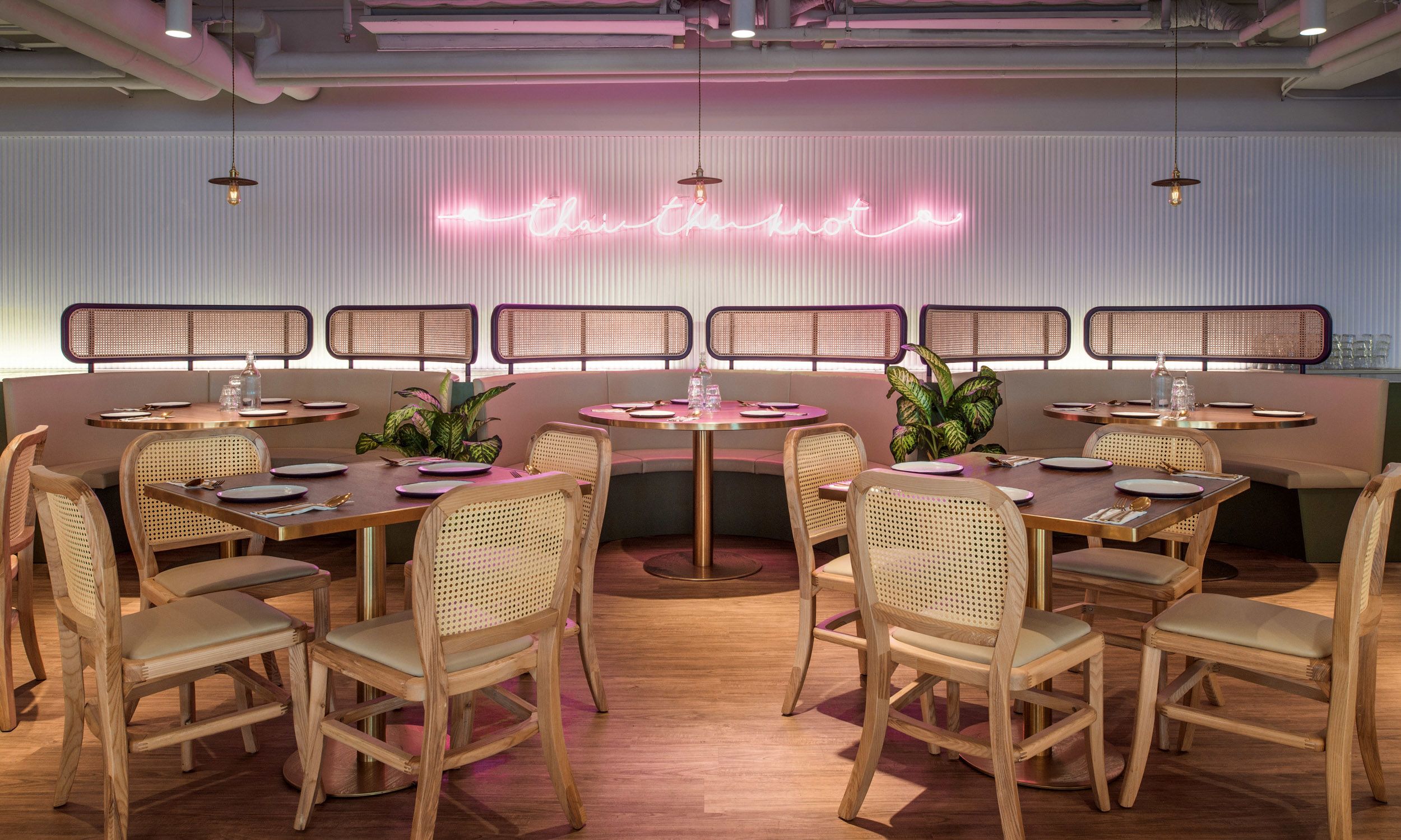
On the side, a series of curved wooden benches forms an intimate seating area, upholstered in vanilla off-white cushions that tie in with the teak wood tables and rattan dining chairs. Colors of terracotta pink, tropical green and mayonnaise white form a harmonic play in the interior area. The al-fresco patio is decked with Moroccan details, adorned with comfortable outdoor furniture and is perfect for whiling away a balmy fall evening.
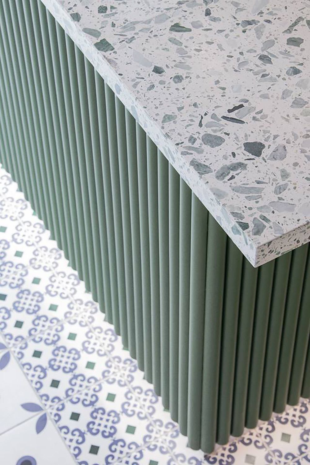
Materials and patterns evoking a Moroccan vibe are seen sporadically throughout the venue, from the floor detailing and vaulted arches in the main dining area to the restroom curved mirrors. The colorful and lively atmosphere arouses a new dining experience and provides a breathing ground amidst all the hustle and bustle.
Brand Identity Concept
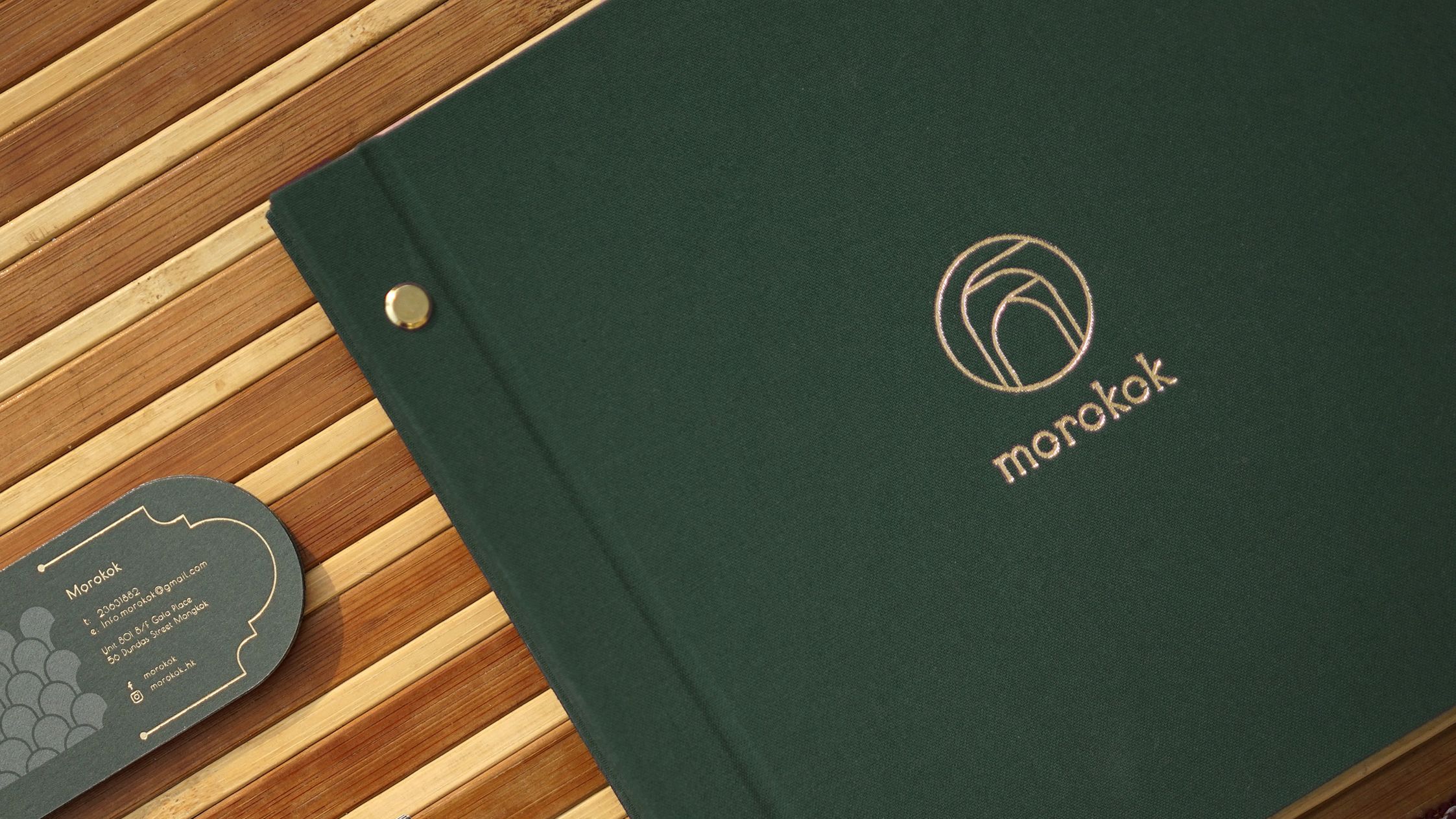
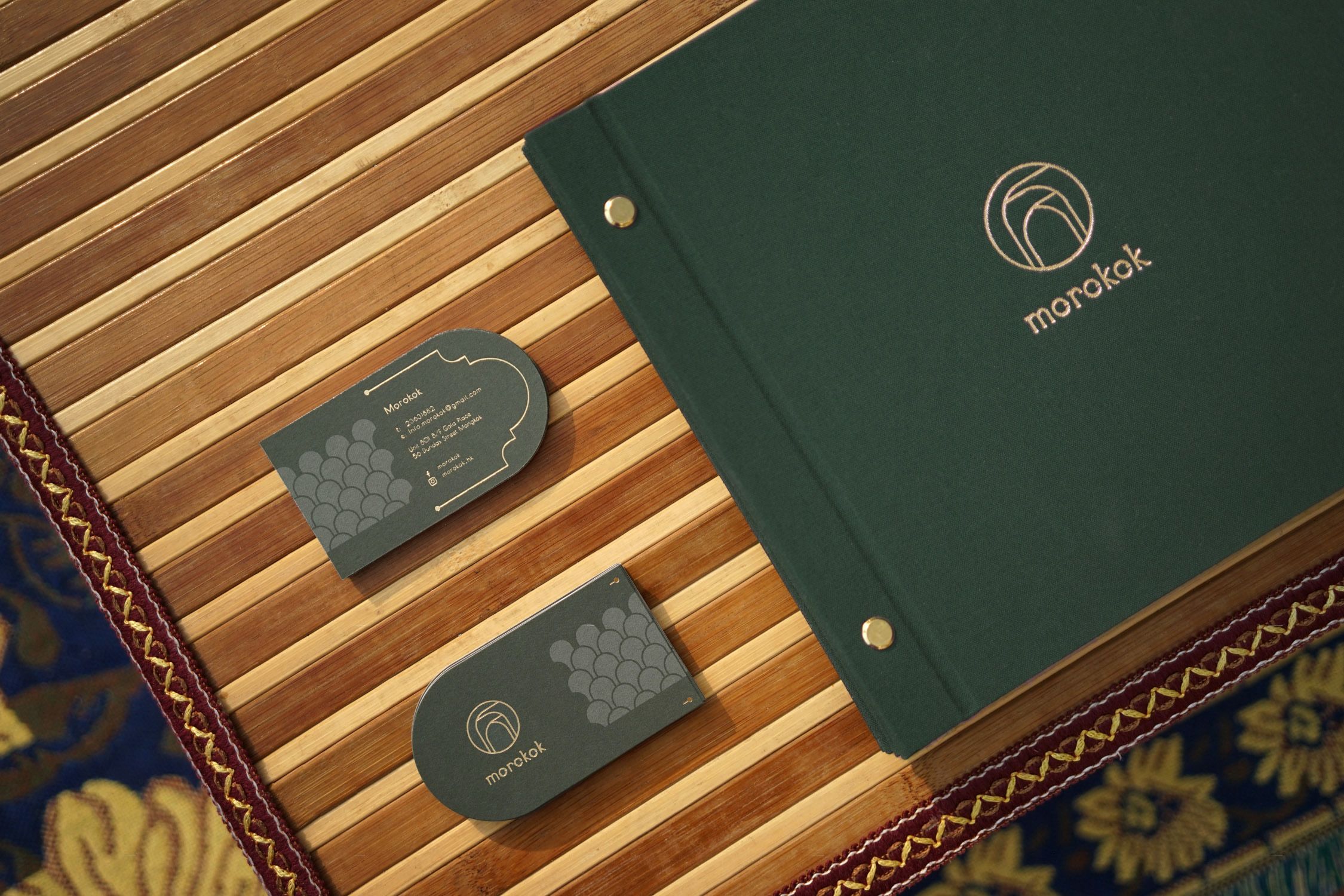
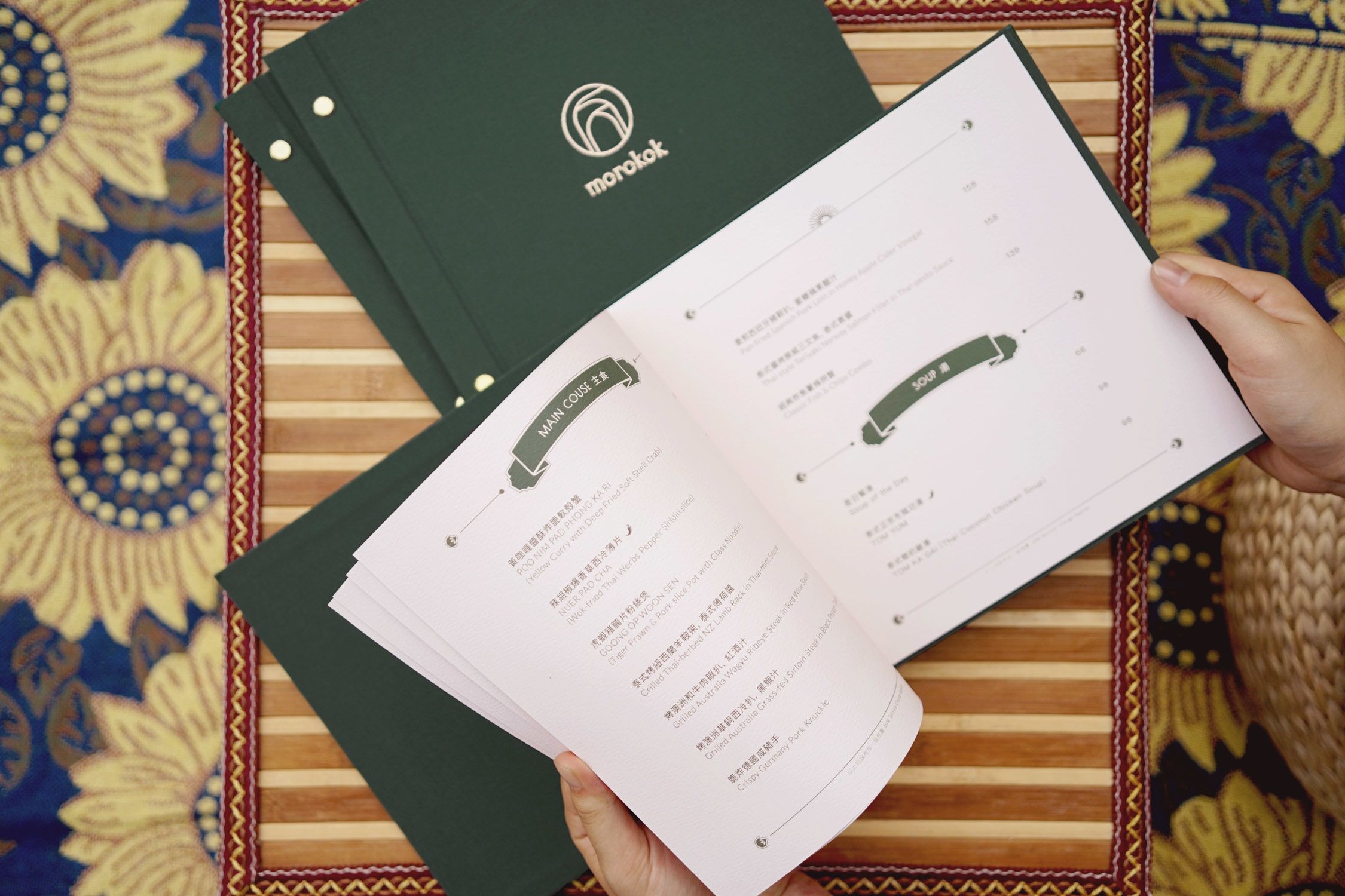
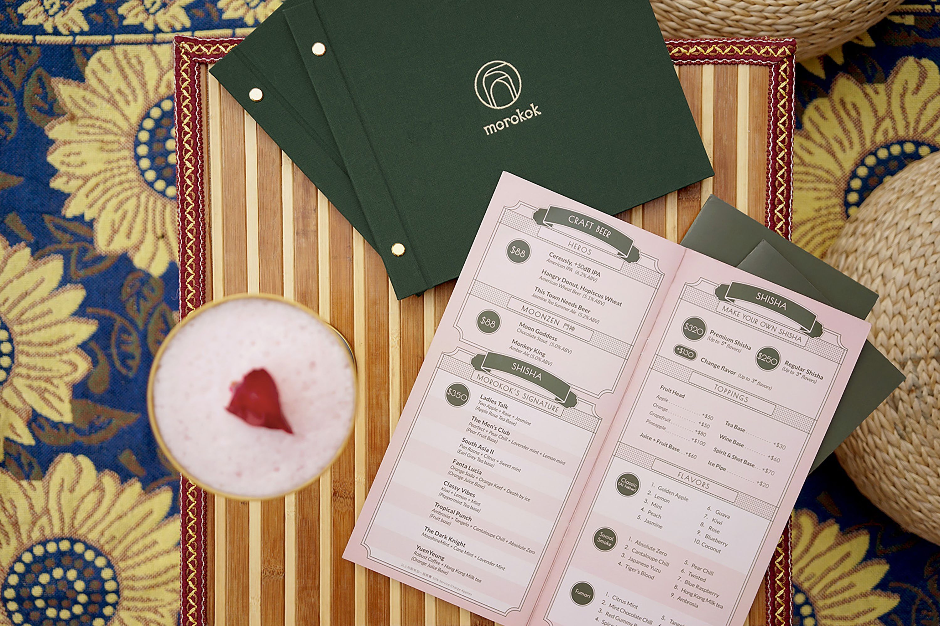
To curate a holistic and mesmerizing dining experience, its brand and visual identity feature the repetitive pattern found in the traditional Moroccan tiles and arches. The logo symbol is simple and straightforward, it creates a depth with repeated curves in clean outlines, resembling the signature arcade of the Moroccan arches at the entrance. The depth of the symbol invites the audience to look through the repeated arches, just as the walking experience through the signature arcade.
For the type-logo, it is a minimal sans serif type-logo with a little tweak on each character to emphasize the repetitive Moorish elements. A small opening is also found on the characters "o", creating a negative horizontal line visually that ties all the characters together.
